You publish a video, watch the views rise, and still can't explain why subscribers, leads, or sales stay flat. The thumbnail may be attracting attention, while the opening loses viewers, the player buffers on a particular device, or the call to action appears after most viewers have already left.
A video analytics dashboard turns that confusion into a sequence of decisions. It connects impressions, playback behavior, viewer experience, audience segments, and business outcomes in one working view. The aim isn't to collect every possible metric. It's to identify the few signals that tell a creator, marketer, or video operator what to change next.
Why Your Views Are Climbing and Your Results Are Not
A creator notices the problem after publishing a video that appears to perform well. Views climb quickly, and the thumbnail earns attention, but the expected subscribers don't arrive. A product video attracts plays, yet the landing page produces few enquiries. The dashboard reports activity, but it doesn't explain the gap.
The usual chain is easy to misunderstand. A strong thumbnail can generate starts. A platform can reward watch time. Distribution can expand because viewers keep playing. None of those signals proves that viewers understood the offer, trusted the brand, or reached the intended action.
A view is a starting point, not a diagnosis. A dashboard that only displays views tells you what happened at the surface. A useful dashboard helps you ask whether people started because the title matched their need, stayed because the content delivered value, left at a specific moment, or failed to watch because playback quality got in the way.
The symptom is not the cause
Suppose viewers leave near the introduction of a tutorial. The response shouldn't automatically be “make more videos.” Check the retention curve, compare it with traffic source and device, and inspect whether the same audience reaches the product explanation in other videos.
Practical rule: Treat every KPI as a prompt for investigation, not as a verdict about the content.
Privacy also matters when you connect viewing behavior with conversion or audience data. Teams should define what they collect, why they collect it, and how users can understand those practices. A clear privacy policy belongs alongside the measurement plan, especially when analytics spans websites, embedded players, and marketing systems.
The practical shift is simple. Creators need metrics that guide the next topic or edit. Marketers need signals that guide distribution and calls to action. Enterprises need evidence about playback quality, capacity, and account-level engagement. The rest of this guide treats the dashboard as a role-based decision tool rather than a wall of numbers.
What a Video Analytics Dashboard Does
A video analytics dashboard turns playback events into evidence for a decision. It collects signals such as impressions, player loads, starts, pauses, seeks, quartile passes, exits, and errors, then organizes them for comparisons across videos, audiences, time periods, and playback environments.
A car's instrument cluster offers a useful comparison. Drivers do not inspect raw engine signals while moving. They need readable gauges for speed, fuel, temperature, and warnings. A video dashboard performs that translation, then connects each signal to an action.
Three jobs make the dashboard useful
First, it aggregates. Instead of opening every upload or platform account, a team can view performance across videos, campaigns, locations, devices, and content series. Enterprise products may expose dozens of metrics and dimensions, including plays, unique users, playback time, drop-off points, completion rates, device details, operating systems, browsers, and geography, as shown by Videas analytics.
Second, it compares. A metric gains meaning when placed beside a prior period, another cohort, or a similar asset. Completion rate for new visitors compared with returning visitors may reveal a distribution or content problem that the overall figure hides. A creator might compare two openings, while an enterprise team might compare playback quality across regions.
Third, it surfaces exceptions. Alerts can identify unusual error activity, a sudden change in startup time, or lower completion for one player version. Set each threshold around a decision. If nobody knows what to do after an alert appears, it adds noise rather than value.
A dashboard differs from raw logs. Logs preserve individual events and technical details. A dashboard summarizes those events for analysis and action. It also differs from an ad hoc spreadsheet, which can depend on manual definitions and inconsistent time windows. Platform-native pages such as YouTube Studio, Vimeo, or Wistia remain useful, but they generally organize data around one platform or property.
A clean metric dictionary prevents disputes. Blue Billywig's video statistics documentation shows why views, player loads, play rate, unique visitors, views per unique visitor, and average view time need separate definitions. If one report treats a player load as a view and another does not, comparisons become unreliable.
Short-form teams also need format-aware comparisons. A practical guide to Reel and Story analytics can help distinguish viewing behavior when content appears in ephemeral and feed-based formats.
For a broader content workflow, LunaBloom AI is one example of a platform combining video creation capabilities with analytics and publishing support. The design test is practical: which five to seven metrics will a specific role watch, and what decision will each metric trigger?
The Core KPIs Every Dashboard Should Track
A dashboard should separate engagement from playback quality. Engagement describes what viewers do with the content. Quality describes whether the technical experience gives them a fair chance to watch. Combining both prevents a slow player from being mistaken for weak creative.
Engagement tells you whether the content earns attention
Start rate is the number of video starts divided by player loads, expressed as a percentage. It indicates whether the placement, title, thumbnail, or surrounding context persuades someone to begin playback. A low start rate should trigger a review of the thumbnail, headline, autoplay behavior, and page placement, not an immediate rewrite of the entire video.
Average watch time measures the typical amount of time watched. Average percentage viewed places that time against the video's total duration, which makes comparisons between short and long assets more meaningful. Strong depth with weak starts points toward a packaging or distribution issue. Weak depth after strong starts suggests a problem with the opening, pacing, or audience fit.
Completion rate is the share of viewers who reach the defined end of the video. It matters most when finishing has a clear meaning, such as receiving the full lesson, seeing the offer, or reaching the final instruction. If completion falls, compare the curve by content type and traffic source before shortening every asset.
Drop-off point identifies the moment when viewers leave. A repeated exit around the same timestamp can reveal a slow introduction, an unexplained transition, a dense explanation, or a call to action that arrives too late. The action might be a tighter opening, a script restructure, or chapter markers that let viewers move through the content.
No universal benchmark range can be applied responsibly across every audience, platform, duration, and objective. Use your own historical cohorts or a relevant external benchmark rather than inventing a target. Industry tools such as Vidalytics benchmarks show why dashboards increasingly pair engagement measures with benchmark and trend context.
Quality protects the engagement story
Startup time measures how long playback takes to begin after the viewer initiates it. Slow startup should prompt an investigation of page weight, player configuration, encoding, network conditions, and delivery infrastructure.
Buffering ratio measures the portion of playback time affected by rebuffering. Rebuffer count records how often playback interrupts. Both should be reviewed by geography, device, browser, operating system, and player version because an acceptable aggregate can hide a serious regional or compatibility problem.
Exit-on-error rate captures sessions that end because playback fails. It belongs beside completion and drop-off, since a viewer who cannot play the video isn't expressing the same preference as a viewer who chooses to leave.
A technically mature dashboard can combine play rate, unmute rate, bounce rate, retention milestones, click-through events, conversions, startup time, seek latency, rebuffer percentage, and playback-failure scores. Vidalytics' benchmark guidance describes this engagement and quality split as a way to distinguish creative changes from delivery problems.
| KPI | Family | What It Measures | Action Trigger |
|---|---|---|---|
| Start rate | Engagement | Starts divided by player loads | Test the title, thumbnail, placement, or autoplay context |
| Average watch time | Engagement | Typical time watched | Review pacing when depth is weak |
| Average percentage viewed | Engagement | Watched time relative to video duration | Compare short and long assets fairly |
| Completion rate | Engagement | Viewers reaching the defined end | Tighten or restructure content when finishing declines |
| Drop-off point | Engagement | The timestamp where viewers leave | Rework the section that repeatedly loses attention |
| Startup time | Quality | Time from play request to playback | Investigate player, page, encoding, or delivery delays |
| Buffering ratio | Quality | Share of playback affected by rebuffering | Segment by geography and device, then tune delivery |
| Rebuffer count | Quality | Number of playback interruptions | Check bitrate, network, CDN, and player behavior |
| Exit-on-error rate | Quality | Sessions ending after a playback failure | Trace error codes and affected versions |
Who Looks at the Dashboard and What They Need
A creator, marketer, and enterprise video operator can open the same dashboard and leave with different next steps. The dashboard should therefore work like a set of role-based workspaces, each showing the small group of metrics tied to a decision.
Creators improve the next video
Creators usually need a focused view of the retention curve, audience geography, start rate, and related content signals. The retention curve shows whether the opening earns continued attention. Geography can reveal opportunities for captions, dubbing, or localized examples. Start rate helps separate a packaging problem from a problem with the underlying idea.
Suppose viewers who start a video continue watching, but few people start it. The creator can keep the topic and test a new title, thumbnail, or placement. If viewers leave during a repeated introduction, the next edit should reach the useful material sooner. Each metric should point to an action, not merely describe what happened.
Marketers connect viewing to business outcomes
Marketing teams often use view-through rate, completed views, click-through events, and attributed conversions to judge whether a video supports its campaign goal. They need to see whether the intended audience watches far enough to receive the message and whether that message leads to a measurable business action.
Cost per completed view can help compare paid distribution, provided completion has the same definition across platforms. Attributed conversion also depends on agreed attribution rules, stable campaign identifiers, and a clear connection between the video event and the business event. Without those joins, a dashboard may make campaign performance look clearer than it is.
A marketer's default view might show five to seven measures, with campaign, audience, and traffic-source filters available for investigation. The trigger could be a budget shift, a revised call to action, or a targeting change.
Enterprise operators protect experience and capacity
Enterprise teams need a different decision set. Their view may include startup time, rebuffer ratio, playback failures, concurrency, and engagement across authenticated or SSO-linked segments. Those signals can lead to player updates, CDN discussions, capacity planning, access-control changes, or service-level reviews.
Data from Mux highlights the value of segmenting startup distributions, rebuffering, errors, and viewer experience by geography and technical environment. Percentiles and regional views can expose tail problems hidden by an overall average. An operator might respond to a regional degradation by checking delivery infrastructure, while a concurrency trend may support capacity planning.
| Audience | Focused KPIs | Decision trigger |
|---|---|---|
| Independent creators | Retention curve, start rate, geography | Choose a topic, revise the hook, or localize packaging |
| Marketing teams | View-through rate, completed views, click-through, attributed conversions | Shift distribution, adjust the call to action, or revise targeting |
| Enterprise video operators | Startup time, rebuffer ratio, playback failures, concurrency | Investigate delivery, plan capacity, or review infrastructure |
Saved views turn one source of truth into separate workspaces. A creator can open a content view, a marketer a campaign view, and an operator a reliability view, without changing the underlying event model. Teams reviewing governance and organizational roles can also consult the LunaBloom AI about page for product context.
Dashboard Design Best Practices That Actually Help
A good dashboard makes the next decision visible. It doesn't reward the team for fitting more tiles onto the screen.
Keep the default view narrow
Set the opening view to five to seven KPIs. Move secondary measures into drill-down panels, detail tables, and diagnostic tabs. A creator may need start rate, average percentage viewed, completion, drop-off, and conversions. A playback engineer may need startup time, rebuffer ratio, error rate, device, and geography.
Segment before you interpret
Segment metrics by the dimensions that can change behavior:
- Device and browser: Find compatibility problems that aggregate results conceal.
- Geography: Identify regional rebuffering, localization opportunities, or delivery gaps.
- Player location: Compare an embedded website player with social distribution.
- Traffic source: Separate search, paid, email, referral, and direct audiences.
- Content series: Compare recurring formats instead of mixing unrelated videos.
A dashboard that offers more than 60 metrics and dimensions can support deep investigation, but that doesn't mean every user should see all of them at once. Movingimage's analytics overview illustrates the breadth available in enterprise reporting, including device, browser, operating system, completion, drop-off, and global geography.
Use percentiles for experience metrics
An average startup time can look healthy while a subset of viewers waits far longer. Display p50 and p95 startup time, and use p95 rebuffer ratio when evaluating the slower or more affected portion of the audience. The median shows the typical session. A high percentile shows the tail that averages often hide.
Align windows and annotate changes
Don't compare a completion rate measured across one period with ad spend measured across a different period. Use the same date range, timezone, attribution window, and cohort definition wherever possible.
Annotate charts with the campaign launch, post date, player release, encoding change, or experiment. A spike without context invites speculation. A spike with an annotation can lead directly to a testable explanation.
Place trend lines above summary tiles so direction appears before a snapshot. Add sparklines inside tables for quick comparison. Reserve color for warnings, regressions, and successful thresholds. If every tile is bright, no alert stands out.
Data Sources, APIs, and Integration Options
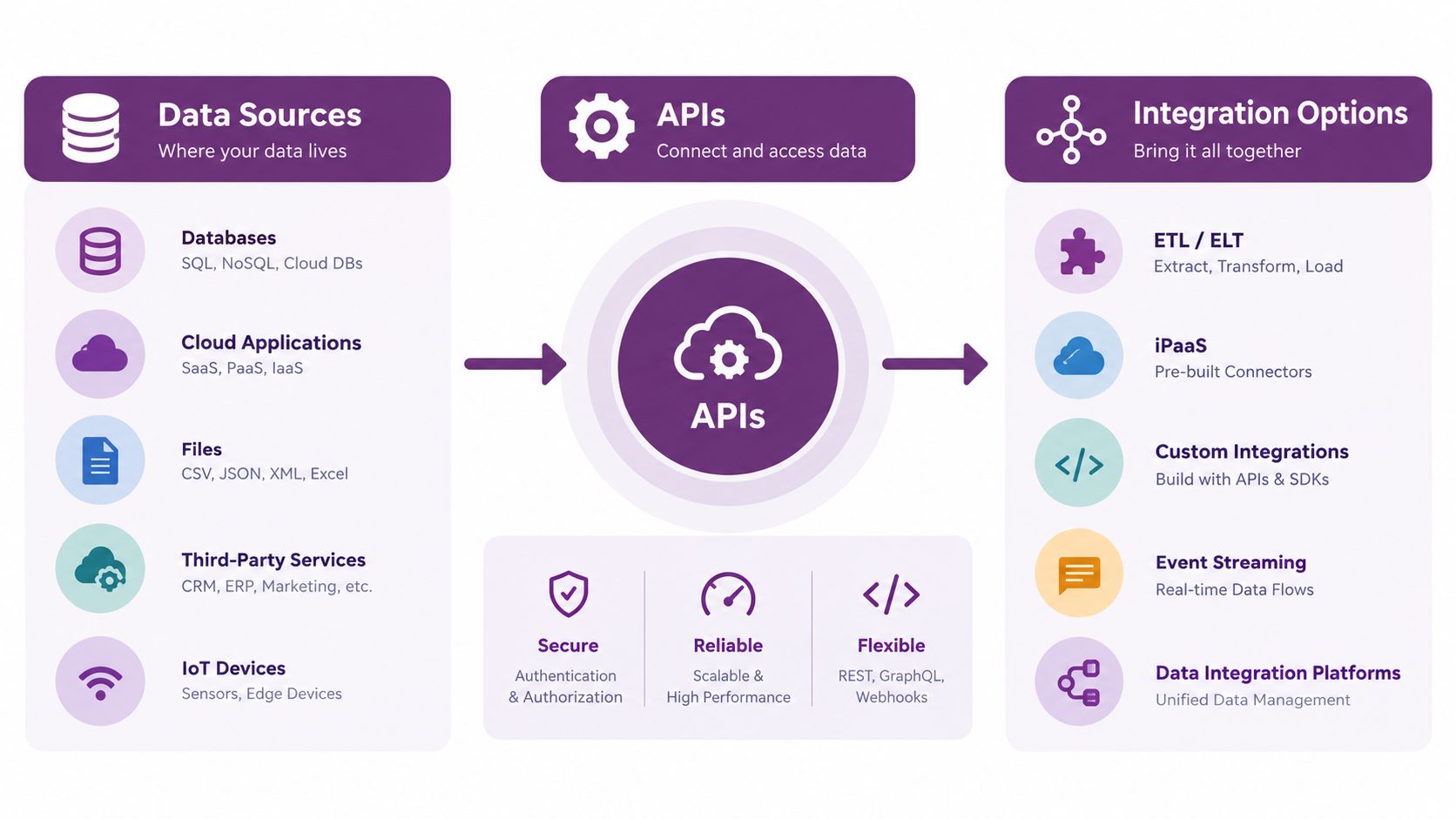
A dashboard tile begins with an event. A player SDK or hosting platform emits a play, pause, seek, quartile, completion, or error event. A collector or platform pipeline normalizes those events into sessions, attaches identifiers, and sends them to an analytics service or warehouse. Aggregation jobs then calculate the values shown on screen.
The important join keys include the video identifier, session identifier, page or campaign identifier, viewer segment, timestamp, and conversion identifier. If those keys aren't stable, the team may see viewing data and business data in separate systems without being able to connect them.
Hosted analytics
YouTube Studio, Vimeo, and Wistia offer the fastest path to useful reporting. The platform handles collection, aggregation, and much of the interface. The trade-off is scope. Data may remain tied to one channel or host, making cross-platform identity, custom funnels, and joins with internal revenue data harder to manage.
Self-hosted analytics
A self-hosted dashboard can combine a CDN, player events, a warehouse, and a business intelligence layer. Teams control the schema, retention policy, custom funnels, and embedding experience. They also own instrumentation, identity resolution, data quality, access control, and maintenance.
A self-hosted design can include fields such as view event, device, browser, operating system, geography, completion, page URL, video duration, time to start in milliseconds, and error codes, as outlined in VdoCipher's self-hosted dashboard guide.
Embedded player analytics
Embedded analytics sits between hosted and self-managed approaches. The player vendor collects events, exposes a REST or GraphQL API, and may provide connectors to BigQuery, Snowflake, Segment, or warehouse-native dashboards. The team gets a defined event model without building every collector from scratch.
Connector choice affects freshness, retention, and the keys available for joining video behavior with campaigns, accounts, and conversions. Ask whether the data is real time or delayed, whether raw events can be exported, how schema changes are handled, and whether historical records remain available.
For broader reporting design, teams may find Search Console beyond 16 months useful when thinking about retention windows and the limits of platform-native reporting. LunaBloom AI's application workspace is another place to evaluate how creation and performance workflows can sit together, but the integration decision should follow your data ownership and reporting requirements.
Turning Dashboard Insights into Smarter Videos
Measurement becomes valuable when it changes the next production decision. A low completion rate may justify a tighter hook or a shorter cut. A repeated drop-off at the same timestamp may call for script restructuring, clearer chapters, or a different order of examples.
Geographic skew points toward localization rather than a generic content rewrite. Captions, dubbing, regional accents, and localized thumbnails can make the same idea more usable for different audiences. A platform such as LunaBloom AI can support video creation, voiceovers, captions, translations, and localized publishing workflows, but the dashboard should determine which audience and asset deserve attention.
Strong retention with weak starts is a packaging problem. Rewrite the title, revise the thumbnail, improve the opening promise, or review search metadata before discarding the video itself. Strong starts with weak retention suggests the packaging made a promise the edit didn't fulfill.
For measurement planning and reporting references, the Data Hunters Agency analytics resource offers useful context around turning reporting into a working process. A weekly review can remain lightweight:
- Export the previous week's top three KPIs.
- Write one hypothesis for each movement.
- Assign one owner to test each hypothesis.
- Record the next publish, edit, localization, or distribution action.
- Review the result against the same segment and time window.
Use the LunaBloom AI starter app when you want to connect production work with a repeatable publishing workflow. The dashboard shouldn't end the process. It should create the next experiment.
LunaBloom AI helps creators and teams turn scripts, prompts, and images into edited videos with voiceovers, captions, localization, thumbnails, and publishing support. Visit LunaBloom AI to explore a workflow that connects video production with the analytics decisions that shape what you publish next.