A plain whiteboard animation can outperform a filmed testimonial. In Switch Video's Rypple case study, the landing page with a custom whiteboard explainer converted 20% better than both the image-and-text page and the live-action testimonial page. That doesn't establish a universal advantage for animation, but it challenges the assumption that a more elaborate production makes a better sales tool.
Explainers often waste their opening on a company introduction when viewers need help understanding a problem. The best animated explainer videos reverse that order. They establish a recognizable situation, explain what changes, and give the viewer a useful next step.
Production rule: Copy the explanation strategy, not the artwork. A recognizable visual style won't rescue a script that never answers the viewer's question.
The examples below range from individual classics to repeatable series and production formats. Each offers a different recipe for scripting, pacing, narration, and AI-assisted production. Suggested runtimes are production starting points, not claims about every original video's duration.
Start with the simplest format that can demonstrate your idea. You don't need a character rig to explain an approval workflow, although a guide to exporting Blender character animations becomes useful when you need reusable character assets rather than another collection of unrelated generated shots.
1. Common Craft's RSS in Plain English (2007)
Common Craft's RSS in Plain English, created by Lee LeFever, makes an unfamiliar technology understandable through paper cutouts, tabletop movement, and friendly narration. The important production choice isn't the handmade appearance. It's the decision to explain the inconvenience before introducing the mechanism.
Instead of starting with feed formats or software terminology, the explanation contrasts checking individual websites with receiving their updates in a central place. Viewers understand the benefit before they encounter the technical vocabulary.
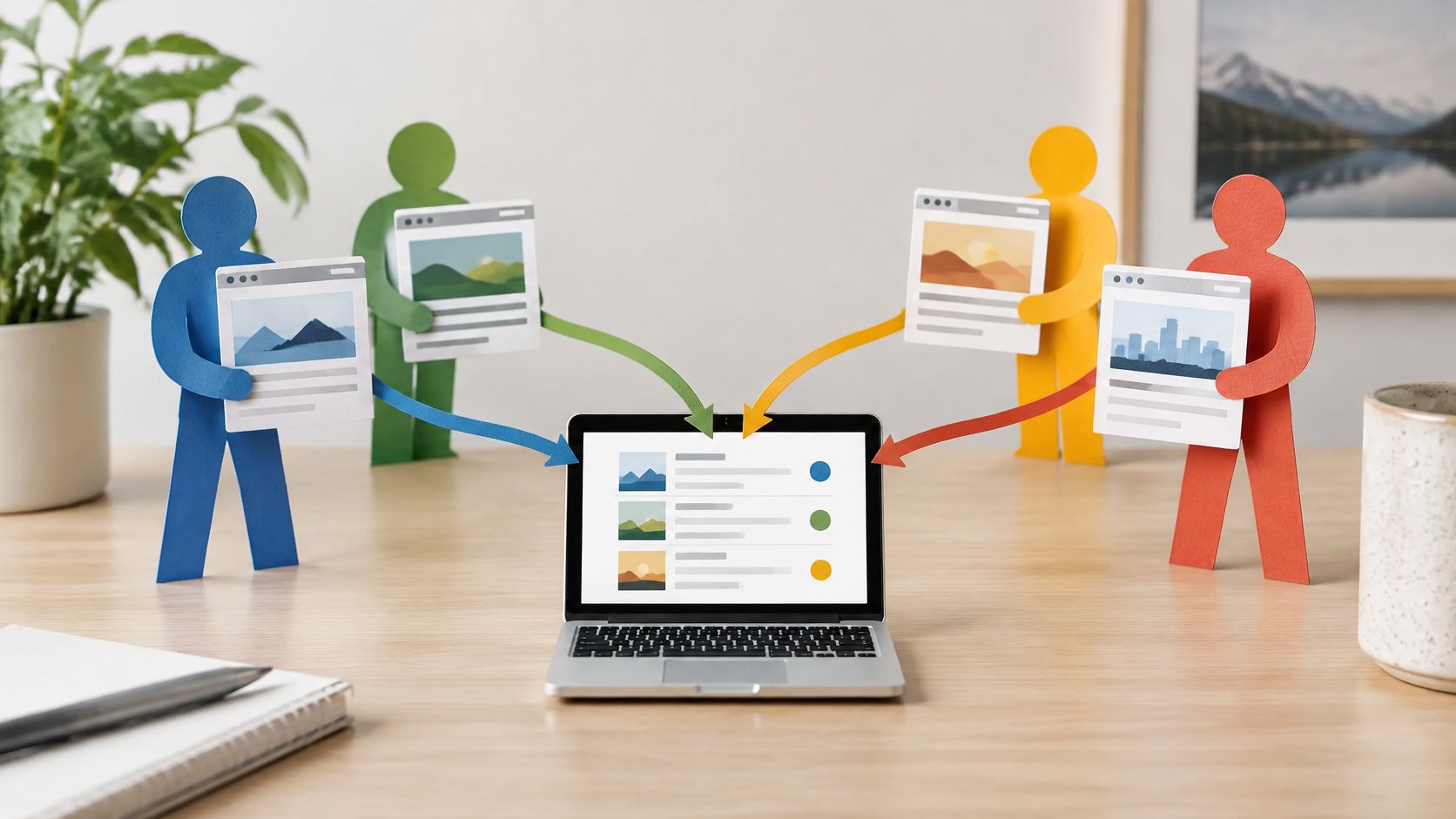
This paper-cutout illustration demonstrates the kind of simple asset system that suits the approach.
Rebuild the problem-to-solution sequence
Use a short, deliberately paced overview for a landing page. Allow more room for education when the audience needs to understand a new category, but cut background that doesn't help explain the central change.
- Script: Familiar frustration, existing workaround, simpler alternative, concrete benefit.
- Pacing: Move or reveal an object when the narrator introduces its meaning. Don't keep everything moving.
- Voiceover: Choose a calm conversational delivery, with clear pauses around unfamiliar terms.
- AI workflow: Generate a consistent set of flat objects, arrange them into scenes, and add restrained slide, reveal, and hand-placement effects.
Say you're explaining an invoice-collection tool. Show someone checking scattered messages, then show incoming invoices collecting in a shared inbox. Explain the consolidation before naming automation features.
Best fit: Category education and abstract software workflows. The trade-off is perceived sophistication: the handmade style feels approachable, but it may undersell a premium product if the design looks accidental rather than intentional.
2. Common Craft's Twitter in Plain English (2009)
Common Craft's Twitter in Plain English demonstrates a different lesson: a useful explainer system can become a recognizable series. The paper figures, plain backgrounds, and reassuring narration remain familiar even as the subject changes.
The explanation connects short updates with ordinary social interaction. That's a better starting point than walking through interface controls, because the audience first needs to understand why anyone would use the service.
Best fit: A product family, help center, or educational channel where viewers benefit from a consistent teaching style. Common Craft's wider in Plain English series, including explanations of wikis and podcasting, provides the model.
Build a reusable episode system
Write a compact, self-contained episode rather than compressing an entire product manual. Keep the pace measured enough for someone unfamiliar with the subject to connect the analogy to the actual behavior.
For a team communication product, an episode might explain why status updates belong in a shared channel rather than scattered private messages. Show the everyday coordination problem, demonstrate the new habit, and finish with the action viewers should take.
- Script pattern: Everyday situation, missing information, shared update, practical payoff.
- Voice system: Keep pronunciation, warmth, and delivery consistent across episodes. Clone a narrator's voice only with permission.
- AI rebuild: Save character references, background treatments, caption styles, and narration settings as a reusable production kit.
- Localization: Translate the meaning of the analogy, not just the words. A familiar workplace routine in one market may need replacing elsewhere.
A series should feel familiar without making every episode sound like the same script with different product names.
The limitation is repetition. Reuse the visual grammar, but vary the opening situation and the kind of problem you solve.
3. RSA Animate from the Royal Society of Arts
RSA Animate turns spoken arguments into illustrated explanations. Sir Ken Robinson's Changing Education Models is a useful reference because the drawings organize an argument rather than merely decorate a speaker's words.
The format suits material that already contains a strong point of view: a founder's presentation, an expert interview, or a webinar. It doesn't automatically make an unfocused talk concise. The editorial work comes before the drawing.
This whiteboard-style illustration shows the relationship between a speaker's explanation and a visible conceptual map.

Edit the argument before animating it
For your adaptation, choose a longer educational summary only when the argument earns it. Retain the speaker's useful pauses and emphasis, but remove housekeeping, repeated premises, and references that depend on the original event.
Build the visual sequence around claims, contrasts, and consequences. A drawing should clarify how ideas connect, not reproduce every noun in the transcript.
- AI preparation: Transcribe the recording, identify the central claim, and draft a scene outline from the strongest supporting passages.
- Visual production: Generate diagram components separately, then assemble them into a controlled whiteboard layout.
- Voiceover: Preserve the original speaker when you have the rights and the recording is usable. Otherwise, commission or generate a clearly authorized replacement.
- Navigation: Add descriptive chapter labels where the player supports them, and check automatically generated labels for accuracy.
A consultancy explaining organizational change could illustrate how approval layers affect decisions, then map a simpler alternative. Measure whether viewers can explain the proposed change afterward, not just whether they finish watching.
Trade-off: Dense drawings can reward attentive viewing but become illegible on a phone. Simplify the mobile version instead of shrinking the entire whiteboard.
4. TED-Ed Animated Lessons
TED-Ed's animated lessons demonstrate how to build an explanation around a learning objective rather than a product pitch. Its Lessons Worth Sharing approach gives educators and training teams a useful reference for combining curiosity with structured teaching.
The lesson format starts with a question or intriguing situation, develops the explanation, and invites further thinking. The animation style can change with the subject because the instructional structure provides continuity.
For a corporate learning team, that could mean explaining why phishing messages create urgency rather than merely listing warning signs. Learners need to recognize the mechanism so they can apply the lesson to an unfamiliar example.
Write the assessment before the scenes
Decide what viewers should be able to explain or do afterward. Then write the closing question before drafting the opening. If the question tests something the animation never teaches, revise the lesson.
Use a short lesson with room for reasoning, not a rapid succession of disconnected facts. Let the narrator introduce the question, allow visuals to demonstrate the mechanism, and pause before revealing the answer.
- Script: Question, necessary context, explanation, application, reflection.
- AI workflow: Draft a storyboard from an approved lesson outline, generate visual concepts, and verify every factual statement before recording narration.
- Voiceover: Choose an interested, precise delivery. Regional accents can suit the audience, but technical pronunciation needs human review.
- Accessibility: Plan captions, a separate transcript, and descriptions of important visual information during production, following W3C's accessible media planning guidance.
Best fit: Employee training, customer academies, and classroom explanations. The trade-off is conversion pressure: inserting repeated sales messages weakens the learning experience. Put the relevant next step at the end instead.
5. Kurzgesagt In a Nutshell
Kurzgesagt, founded by Philipp Dettmer and launched in 2013, provides a reference for systematic art direction. Its science explainers use bright flat illustrations, clear silhouettes, diagrams, and controlled changes in scale to make abstract subjects visible.
The studio's work on biology, space, climate, and humanity's future shows why consistency matters. A viewer can follow a complicated explanation more easily when the same visual treatment represents the same kind of object or relationship.
This space-themed illustration reflects the subject matter, rather than a frame from a particular video.

Copy the discipline, not the birds
For a business adaptation, choose a focused mid-length explanation with distinct conceptual stages. Start with the question, establish a comparison viewers understand, explain the mechanism, and acknowledge important limits.
Use narration that stays composed while the visuals change scale or reveal relationships. Fast delivery isn't a substitute for editorial compression.
- Visual system: Define colors, outline rules, typography, object proportions, and diagram conventions before generating scenes.
- AI workflow: Create an original style sheet and approved asset library. Generate against those references rather than prompting each shot independently.
- Credibility: Keep a claim ledger linking the script's factual statements to supporting material, and publish appropriate references.
- Use case: Explain how a cybersecurity threat moves through a network using consistent symbols for users, devices, and permissions.
Best fit: Thought leadership and complex category education. The trade-off is production discipline: polished flat animation requires careful compositing and continuity checks, even when AI accelerates asset creation.
Don't imitate a distinctive studio identity. Build an original system that helps your audience understand your subject.
6. Vox Explainers and Motion Graphics
A chart can be accurate and still be difficult to understand. Vox's explainers offer a useful model for introducing evidence gradually through maps, motion graphics, labels, and narration.
After its 2014 launch, Vox made explanatory video a recognizable part of its editorial identity. Its work on healthcare, elections, and economics, alongside Explained, provides references for answering a clear question without relying on character animation.
The production lesson is sequencing. Show the relevant comparison, explain what changed, and only then introduce the next layer. Displaying every label at once gives viewers a reading assignment instead of an explanation.
Make each graphic answer a question
For a business version, use a short evidence-led narrative. State the answer early, then demonstrate why it holds. Choose a confident narrator who distinguishes observations from interpretations rather than making every sentence sound equally certain.
Say a logistics company needs to explain delivery variability. Begin with the customer's question, show the route, identify the bottleneck, and demonstrate what the proposed process changes.
- AI assistance: Use transcription and script tools to organize the argument. Build charts from checked source values, not AI-generated chart images.
- Pacing: Reveal an axis, comparison, or annotation when the narration explains it.
- Text: Keep labels readable on mobile and distinguish editorial emphasis from actual chart values.
- Search distribution: Give the finished video descriptive page text and accurate metadata.
For discoverability, Google's video SEO guidance calls for an indexed watch page, an accessible embed, and a valid thumbnail at a stable URL; it also recommends appropriate video structured data and sitemaps.
Trade-off: This format supports credibility, but misleading scales and unsupported causal claims can undermine the entire production.
7. Hand-Drawn Whiteboard Explainers for SaaS Onboarding
Some onboarding fails because the user meets the interface before they understand the process behind it. Whiteboard animation solves that sequencing problem. The hand draws each element as the narration names it, so the viewer receives one idea at a time instead of a finished diagram to decode.
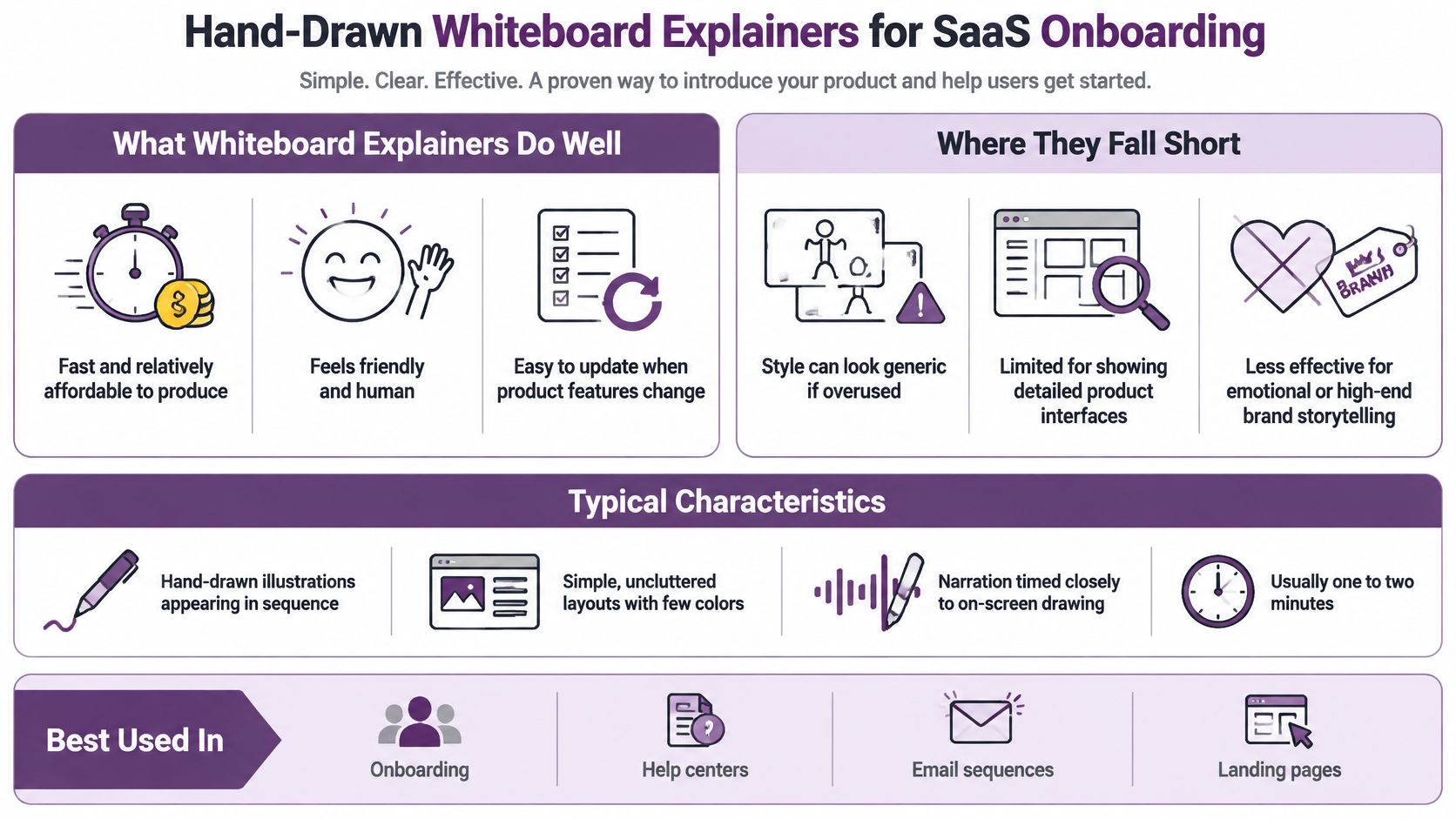
Best fit: onboarding, feature introductions, and help documentation. Say your software requires users to connect a data source before creating a report. Sketch that dependency as a drawing, then cut to an accurate interface capture for the connection step itself. The concept gets a metaphor; the control gets the actual screen.
The embedded video shows the drawing sequence and narration working together.
Animate the concept, demonstrate the controls
Keep the runtime task-sized. A good whiteboard explainer ends the moment users know what to do next, and padding it with secondary features dilutes the one action the video exists to teach.
Build the recipe in four moves: the user's question, the dependency drawn step by step, the product shown at the moment of action, and a closing line that names the next step. Voice it with a calm, reassuring narrator, and reveal each dependency only when the narration reaches it. A synthetic hand that spends longer shading a decorative border than explaining the action is budget spent on decoration.
- Script: user's question, drawn dependency, real interface moment, next step.
- Pacing: draw each element when the narration names it; never let the hand linger on ornament.
- Voiceover: steady and reassuring. The drawing supplies the energy, so the voice doesn't have to.
- AI rebuild: turn an approved support answer into a scene outline, generate consistent icons, and draft the sequence in the starter app. Check every instruction against the current product before publishing.
- Maintenance: keep interface captures separate from conceptual scenes so a product update only costs you one clip.
- Captions: review timing, speaker identification, and meaningful audio cues, which are part of the WCAG guidance for synchronized media.
The limitation is precision. Whiteboard metaphors explain relationships well, but they can't replace a real demonstration when users need to find a specific button or setting.
8. Duolingo's Animated Social Video Content
Duolingo's Duo owl demonstrates how a character can connect product education, humor, and brand recognition. Its animated product content, including Duolingo Adventures, provides a reference for explaining functionality through recognizable situations rather than formal narration alone.
Don't treat every mascot appearance as an explainer. A joke that attracts attention and a video that teaches a feature have different jobs. For educational content, viewers should leave knowing something useful even if they miss the joke.
Give the character a practical task
Build a brief vertical story around an obstacle. Show the character encountering a learning problem, demonstrate the relevant feature, and end with a specific invitation to try it.
A language-learning product might show a character struggling to order food, rehearsing the exchange, then applying the phrase. The narrative makes the feature relevant without requiring a list of capabilities.
- Script: Situation, difficulty, demonstration, payoff, next action.
- Pacing: Use quick reactions around the teaching moment, but slow down enough for viewers to read the instruction.
- Voiceover: Choose expressive dialogue or minimal narration. The character doesn't need to speak constantly.
- AI rebuild: Define an original avatar's appearance, expressions, and behavior, then develop scenes in the video creation app.
Keep the learning point understandable when the joke, soundtrack, or cultural reference doesn't translate.
Localize humor and examples, not merely dialogue. Maintain continuity in the character's appearance, but allow different markets to use situations their audiences recognize.
Best fit: Social feature education, reminders, and recurring product updates. The trade-off is tone: an irreverent mascot can make routine learning approachable, but it may be inappropriate for sensitive topics or high-stakes instructions.
How the eight best animated explainer videos compare on runtime, animation style, and best use
Runtime follows the job the video has to do, so read this table as a set of production starting points rather than a spec sheet.
| Item | Typical Runtime | Animation Style | Best For |
|---|---|---|---|
| Common Craft: "RSS in Plain English" (2007) | Roughly 2–4 minutes | Paper cutouts on a tabletop | Explaining one concept simply to beginners |
| Common Craft: "Twitter in Plain English" (2009) | Roughly 2–4 minutes | Paper cutouts on a tabletop | Making unfamiliar platforms approachable |
| RSA Animate (Royal Society of Arts) | 10 minutes or more | Real-time hand-drawn illustrations | Summarizing talks and complex ideas |
| TED-Ed Animated Lessons | Roughly 4–6 minutes | Varied custom animation styles | Teaching a single idea with a clear learning arc |
| Kurzgesagt – In a Nutshell | Often 3–10 minutes for a focused concept | Bright, bold flat-design animation | Making complex science engaging |
| Vox Explainers (Motion Graphics Series) | Often 3–10 minutes for a focused concept | Motion graphics, charts, maps, and text | Explaining news, data, and trends |
| Hand-Drawn Whiteboard Explainers for SaaS Onboarding | Usually 1–2 minutes | Sequential hand-drawn illustrations | Software onboarding and product education |
| Duolingo's Animated Social Video Content | Roughly 15–60 seconds | Character-led animation with a mascot | Social content that blends humor and learning |
Runtimes are typical ranges for planning your own production, not the exact durations of the original videos.
The pattern is consistent: the closer the video sits to a moment of action, the shorter it runs. Onboarding and social content stay under two minutes because the viewer is mid-task or mid-scroll. Explainers that carry an argument, like an illustrated lecture or a science concept, earn longer runtimes because the payoff depends on buildup.
Style carries its own trade-off. Paper cutouts and sequential whiteboard drawings are the cheapest patterns to rebuild because each frame is simple and the narration does the work. Custom animation and character-led pieces cost more to produce and hold continuity, so commit to them only when personality or visual detail is the point. Motion graphics sit between the two: charts and maps are reusable assets, which makes this the most practical style when your content changes with the news or the data.
Turn These Eight Patterns Into Your Next Explainer
The best animated explainer videos make a specific idea easier to understand. They introduce a recognizable problem, control the order in which viewers receive information, and finish with a next step that matches the explanation.
Choose the format by the communication problem, not by the animation style you happen to like. Use Common Craft's approach for unfamiliar concepts, RSA-style illustration for an existing argument, TED-Ed's structure for learning, and evidence-led motion graphics when viewers need to understand a comparison. Reserve character-led social content for situations where personality helps rather than distracts.
Produce a useful draft before a polished film
Write the opening problem, central explanation, and final action before generating assets. Read the script aloud, then build an animatic, a rough sequence of still images with temporary narration. If the explanation doesn't work at that stage, more movement won't fix it.
A commercial industry benchmark summarized by A-Wall reports approximately 65% completion for videos under one minute, supporting a short initial cut as a useful test rather than a universal runtime rule. Use a longer version when the viewer's task requires it, and separate optional detail into supporting chapters.
- For acquisition: Test qualified enquiries and conversion, not just plays.
- For onboarding: Check whether viewers complete the intended product task.
- For education: Ask viewers to apply or explain the idea afterward.
- For social content: Evaluate the relevant next action alongside retention.
HubSpot's video marketing statistics report that 74% of companies measure video ROI primarily through engagement signals, while 48% use conversion rates. That distinction matters: an entertaining video can hold attention without helping the business or the viewer.
Keep human review in the workflow
AI tools can accelerate scripting, asset generation, narration, captioning, and revisions. They don't remove the need to check factual accuracy, visual continuity, pronunciation, permissions, and accessibility.
LunaBloom AI is one option for combining script-to-video production with voiceovers, captions, avatars, and localized versions. Use those capabilities to test an original explanation quickly, not to reproduce another creator's identity.
Choose a customer question from your support inbox or sales calls. Draft the simplest answer, select the recipe that fits it, and publish a test where that question arises. Improve the explanation based on what viewers understand and do next.
LunaBloom AI turns scripts, prompts, and images into edited videos with voiceovers, captions, and customizable avatars. Visit LunaBloom AI to turn a customer question into an animated explainer draft, then refine its pacing, visuals, and next step before publishing.