Your team has already shot the footage. Someone in the review meeting says the video feels flat and asks whether you can make it interactive, and by the end of the call the wish list includes a quiz, three branching paths, and a hotspot pinned to the product. The deadline hasn't moved.
The builds that ship on that timeline share three habits. They commit to one primary action instead of five. They produce a non-interactive control from the same script so the result can be judged. And they design every choice so any viewer can read it, reach it, and act on it, including people watching with the sound off.
Get those three habits in place and the rest is mechanical. Skip them and you end up with a video that has buttons, no evidence that the buttons help, and a rebuild scheduled before the quarter ends.
Interactive Video Formats and When Each One Works
Interactive video lets a viewer do something other than watch in sequence: make a choice, open extra information, answer a question, or pick a version. The format you choose should follow from the single action you want that viewer to take, because each format carries a very different build cost.
| Format | Viewer action | Best for | Build effort |
|---|---|---|---|
| Branching choices | Picks a path at a decision point | Training, role-based onboarding | High |
| Clickable overlays | Taps a hotspot for detail | Product demos, ads | Medium |
| Quizzes | Answers questions and gets feedback | Training, education | Medium |
| Personalized variants | Chooses language, role or region | Localization, onboarding | High once variants multiply |
| Chapter navigation | Jumps between sections | Long tutorials, explainers | Low |
| Polls | Votes on a question | Social posts, live audiences | Low |
Where the build effort actually goes
Branching is expensive for a reason that catches people late. Every path needs its own scenes, and each scene needs to be shot, edited, captioned, translated and tested. Cost multiplies by paths rather than adding to them. A three-way branch on a three-minute onboarding video is not three minutes of extra work, it's a second and third short film plus a navigation layer.
Overlays are cheaper because the master cut stays intact. You shoot one version, then add a hotspot layer that opens product details, specs or a size chart. When the marketing team changes a claim, you edit the panel, not the footage.
Chapter navigation costs almost nothing and should be standard on anything over four minutes. Polls are the cheapest entry point of all because nothing in the video file changes. Personalized variants stay manageable at two to four versions and become a maintenance problem past that, which is why teams often prefer one cut with a language selector and separate subtitle tracks.
Why optional layers need real value
A naturalistic study of interactive esports viewing tracked telemetry from more than 300,000 unique viewers across a four-week international tournament, where viewers could open an extension for live statistics, match status and highlight recaps. About one-third of viewers used it, but among those who engaged, 55% opened the extension once and never returned, which the ACM study of interactive esports viewing treats as shallow engagement.
Two lessons carry straight into marketing video. An optional layer can serve a large minority without disrupting everyone else. And a tap proves curiosity, not value. Repeat visits and time spent inside the layer tell you whether the thing you built is worth keeping.
Metrics That Show Whether Interaction Works
The number that gets reported is usually the wrong one. A campaign dashboard shows a healthy interaction rate, the deck calls the interactive version a win, and nobody can say whether it sold anything. A tap is an event, not an outcome.
Before launch, choose one primary metric and build a non-interactive control from the same script. Split a comparable audience at random. Then read every number against that control rather than against zero.
| Metric | What it tells you | Watch out for |
|---|---|---|
| Interaction rate | Share of viewers who tap a choice or hotspot | Counts first taps, not depth |
| Repeat interaction | Viewers who come back to the interaction | Strongest sign the layer has value |
| Completion rate | Share who finish the video | Varies by device and length |
| Earned time | Extra seconds watched beyond the standard ad | Depends on placement |
| Downstream conversion | Purchases, sign-ups or quiz passes | Needs a matched control group |
| Incremental lift | Difference from the non-interactive version | Requires a randomized split |
Read the signals together, not one at a time
A 2018 peer-reviewed study built a multidimensional engagement model from 263 participants and identified four related dimensions: physical interaction with an interface, the user's assessment of that interface, cognitive absorption in the content, and digital outreach such as sharing. Structural-equation modeling showed that more interaction and more positive evaluations predicted stronger cognitive absorption, which in turn predicted greater intent to manage and distribute content socially. The study of engagement with interactive media also found these dimensions predicted attitudinal and learning outcomes.
The sample isn't globally representative, so treat the model as a checklist rather than a benchmark. It tells you which signals to collect. It doesn't tell you what a good number looks like for your audience, and no published benchmark can, because your control group is the only honest comparison.
The rule I use: if repeat interaction and downstream conversion both beat the control, the interaction earns its build cost. If only the first tap moves, you built a novelty.
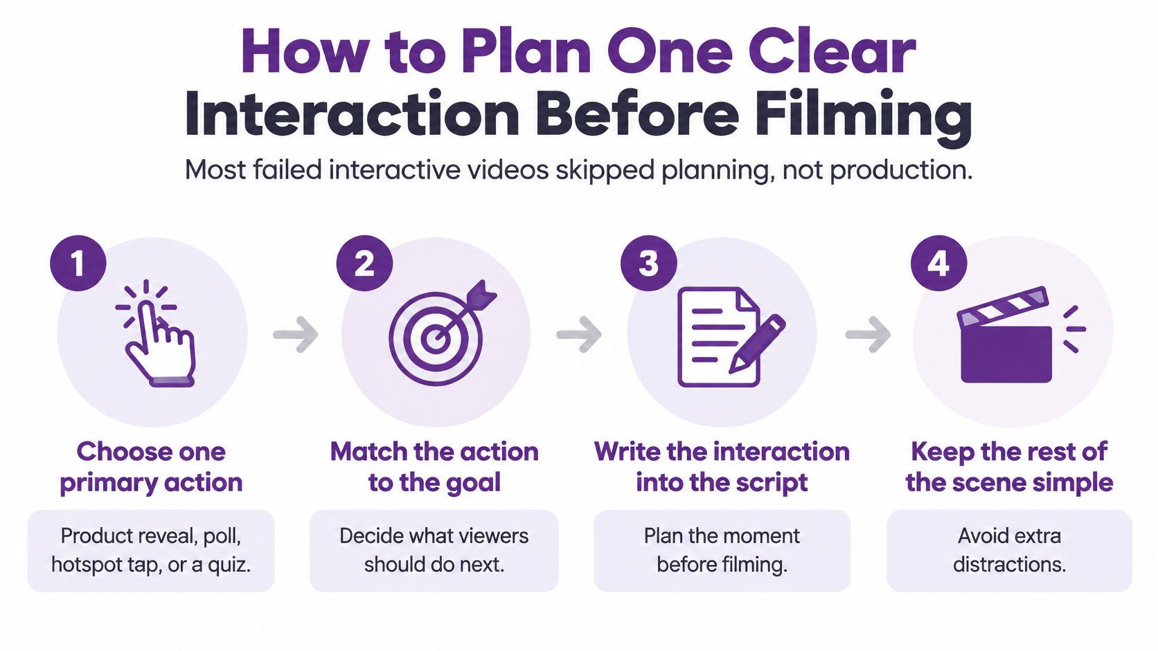
How to Plan One Clear Interaction Before Filming
Almost every interactive video that fails skipped planning rather than production. The footage looked fine. The interactions were bolted on afterward, so the choice arrived before the viewer understood the offer, or the branch led to a scene that explained something the viewer had already seen.
Here's the build order I'd use on a new project.
- Choose one primary action. A product reveal, a poll vote, a hotspot tap, a quiz answer, or a click-through. One. Write it at the top of the brief.
- Write the value proposition for the first two or three seconds. Viewers decide whether to stay before they've heard the offer. If the opening is a logo and a hold, the interaction never gets seen.
- Place the interaction after enough context. Usually once the offer has been explained and the viewer has a reason to want more detail.
- Keep choices to two or three. A fourth option adds decision time and a scene to produce without adding information.
- Build a non-interactive fallback. Some players, some devices and some viewers won't interact. They still need a coherent video.
- Create a control version without interactivity. Same script, same footage, same length where possible.
- Give every branch a unique event ID. Otherwise you can't tell which path people took, where they abandoned, or which one converted.
- Fix the primary metric and the randomized split before launch. Deciding how you'll judge the test after seeing the numbers is how teams talk themselves into a win.
What the benchmarks say, and what they don't
Historical IAB and Innovid benchmark data found that interactive video produced a 591% lift in total user activity over standard pre-roll and generated an additional 44 seconds of earned time on average, according to the Innovid fall benchmark report published by IAB. The same benchmarks show how much completion depends on device and duration: about 57.5% completion on mobile and 60.7% on connected TV, while videos of 30 seconds or less reached 80% or higher across devices against 67 to 77% for longer ones.
Those numbers are useful context and dangerous as targets. Comparing forced-view connected TV traffic against voluntary mobile viewing will make any creative look better or worse than it is, because the platform drives the gap more than the edit does.
How to Build Branching Choices and Clickable Overlays
A warehouse onboarding video needs different safety guidance for forklift operators, pick-and-pack staff, and inventory clerks. A branch at the ninety-second mark can send each new hire to the relevant scenes, but only if the full route is planned before filming begins.
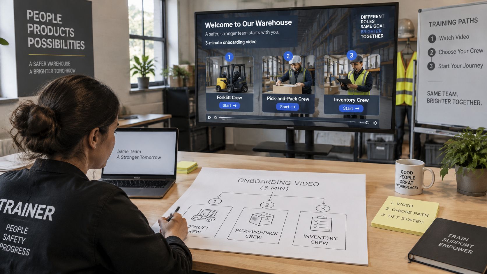
Draw the map before you shoot
Building branches as you edit often leaves gaps: a path needs a reaction shot that was never filmed, or a scene ends without resolving its instructions. Map the routes first. A simple paper sketch can expose those problems before they require a re-edit.
- Draw every scene, choice and ending. Include what happens if viewers back out or let a prompt time out.
- Film each decision moment with a clear prompt. Leave enough time to read the options, and say them aloud so listeners can follow without watching.
- Place hotspots over the picture. Keep each one close to the object it describes and large enough to tap on a phone.
- Connect each choice to its target scene. Use the branching or link feature in your player or editor, and name links so collaborators can follow the structure.
- Test every route from start to finish. Check endings and fallbacks on a slower phone, not just a desktop preview.
- Describe visual decision points in audio. Check that viewers can use every control with a keyboard and screen reader.
- Keep captions clear of buttons and hotspots. Check their position throughout the video, including when a prompt appears.
Accessibility belongs in the branch design
Many television ads still omit captions and audio description, while a large share of social media viewers rely on captions. Build accessibility into each branch rather than treating it as a final check.
Caption the choices in sync with their appearance, and make the transcript useful for following the available routes. Describe visual prompts in the audio, make controls work with a keyboard and screen reader, and leave enough time for viewers to read and choose.
Before publishing, check each route at phone size: choices must be readable, hotspots reachable by keyboard, and captions clear of controls. Confirm every branch reaches an ending, including the back-out path. Then play the video with the sound off and make sure the choices still make sense.
How to Add Quizzes and Personalized Paths
A ninety-second sales enablement video can open with a practical question: does the viewer work in sales, support or operations? Each answer routes to a matching thirty-second cut, followed by one knowledge check on what that team needs to know. The question earns its place because it changes what the viewer sees.
Three quiz types and what each one is for
Knowledge checks follow a segment and confirm whether viewers caught its key point. Use one question and immediate feedback; a score is usually unnecessary.
Scored quizzes close a longer course and record whether someone passes. They fit situations where completion needs to be documented.
Diagnostic quizzes send viewers down different paths. A focused question can replace a menu when the answer determines which information matters next.
Feedback matters more than a score. Explain why an answer is right within a couple of seconds, both on screen and in the audio. Without an explanation, a quiz can reward guessing and teach very little.
Keep personalization manageable. Two to four variants are a useful working range: every added version means more scenes to produce, edit, caption and test. Ask only for information viewers need to share, and keep each question brief enough to answer on a phone.
A SAT preparation timeline for high schoolers organizes study around a starting score and test date. In a video, the equivalent is a question that routes viewers to the path relevant to their situation.
Put the quiz after viewers have received useful information. A question about a product has little value before the video gives them a reason to care.
For videos under five minutes, cap the quiz at three questions. Track pass rate and drop-off for each one, then review which question loses viewers. Test every answer combination, including paths that seem unlikely. If a question has high drop-off, shorten or clarify it before adding a reward.
Localizing and Captioning Interactive Video for Every Viewer
A viewer who cannot read a choice in time cannot use it. Captions and interface text need to work together, especially when a video plays muted or a viewer relies on captions to follow dialogue.
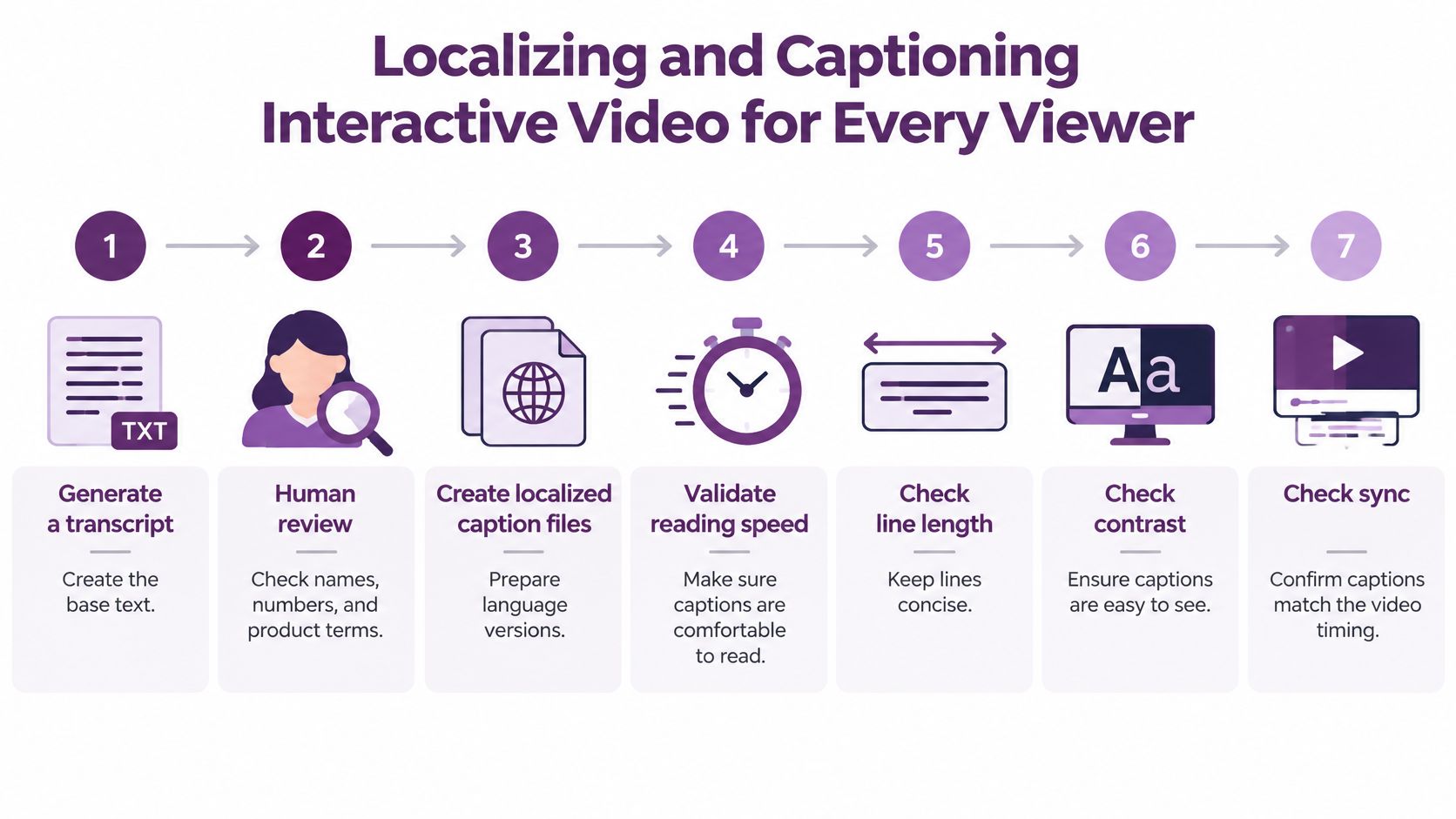
The pipeline, in order
- Generate a transcript from the final cut. The finished edit may differ from the script.
- Have a human review names, numbers, product terms and timing. Automated transcription can misread jargon, model names and part numbers.
- Create localized caption files for each language and region. Add speaker labels when more than one person talks.
- Check reading speed, line length, contrast and synchronization against the QA table below.
- Test silent autoplay and sound-on playback separately. Captions may obscure a choice in one version, while timing or speaker labels fail in the other.
Captions support viewers who watch without sound and help make spoken content accessible. They do not guarantee that viewers will finish a video or remember an ad.
Set pass conditions before you publish
Burn captions into the silent-feed creative, and provide an editable subtitle track for translations and accessibility tools. Check every language version against the same criteria.
| Check | Target | Common failure |
|---|---|---|
| Reading speed | About 15 to 20 characters per second | Captions run ahead of the speaker |
| Line length | Up to about 42 characters per line | Lines wrap awkwardly on mobile |
| Text contrast | Light text on a dark backing plate, checked on the brightest frame | Captions vanish over bright footage |
| Choice timing | Choices stay on screen long enough to read and decide | Viewers miss the prompt |
| Controls clearance | Captions never overlap buttons or hotspots | Choices become unreachable |
| Terminology | Product names and figures checked by a human | Machine errors in technical terms |
Common localization failures include literal translations of idioms, missing speaker labels, captions covering buttons, low contrast over bright footage and unchecked transcription errors in technical terms. Each can make a choice harder to understand or use.
Measure completion, comprehension, interaction and errors separately for each language. Compare those results with a non-interactive control in the same language. A result from one language does not establish that another version works equally well.
Pick One Interaction and Test It This Week
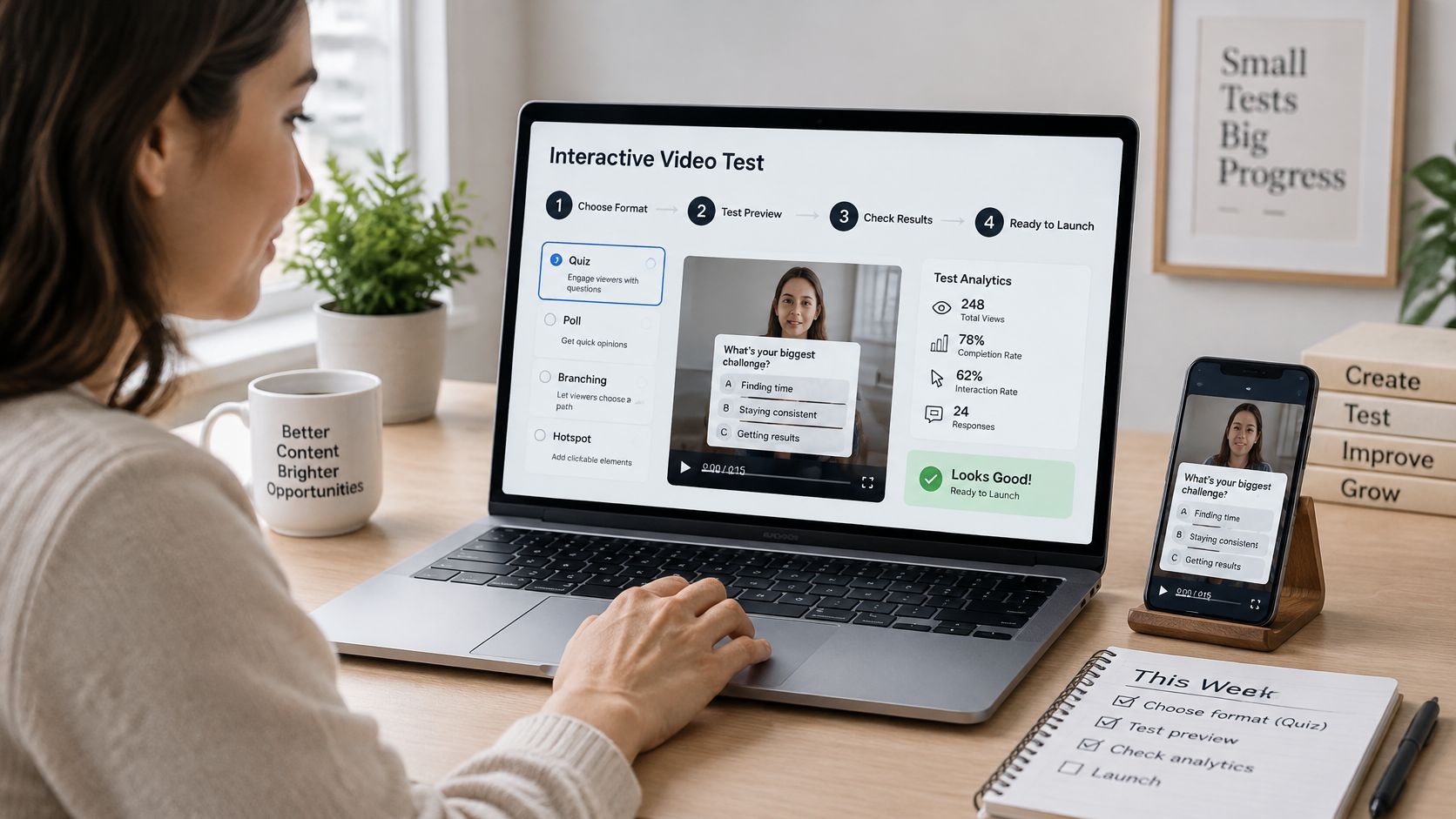
You don't need a platform migration to start. You need one video, one choice, and one control.
- Pick the format that matches the action. Use the first section's comparison to choose between a hotspot, a quiz, a branch or a chapter menu.
- Cut the control from the same script. Same footage, same length, no interactivity.
- Build the interactive version using the planning order above and cap it at two or three choices.
- Run the caption, timing and branch checks from the localization section on every path, in every language you're shipping.
- Publish both versions to a randomly split, comparable audience. Wait until each group has enough viewers for a difference to be visible.
- Read repeat interaction and conversion first, then decide whether to expand the format or fix it.
The tooling requirement is modest: a player or editor that supports links or hotspots, a way to split the audience, and an event log with unique IDs per branch. LunaBloom AI generates both cuts from one script, and the Starter plan includes text-to-video and image-to-video generation, dialogue video, custom music upload, AI Song and Dance video, plus basic templates and backgrounds. Image-to-video is the piece that turns a product shot or a photograph into a scene you can branch from, which is usually where a demo build starts.
Start with one interaction you can defend. A hotspot that opens the spec sheet people keep asking about will beat a branching story every time.
LunaBloom AI takes a script through visuals, voice, music, captions and publish in one place, so you can produce the interactive version and the non-interactive control from the same source material and localize both without re-shooting. Bring one offer, one choice and one measurement plan, and the studio handles the animation, sync and editing while you keep the running order. Build your first test this week at LunaBloom AI.