
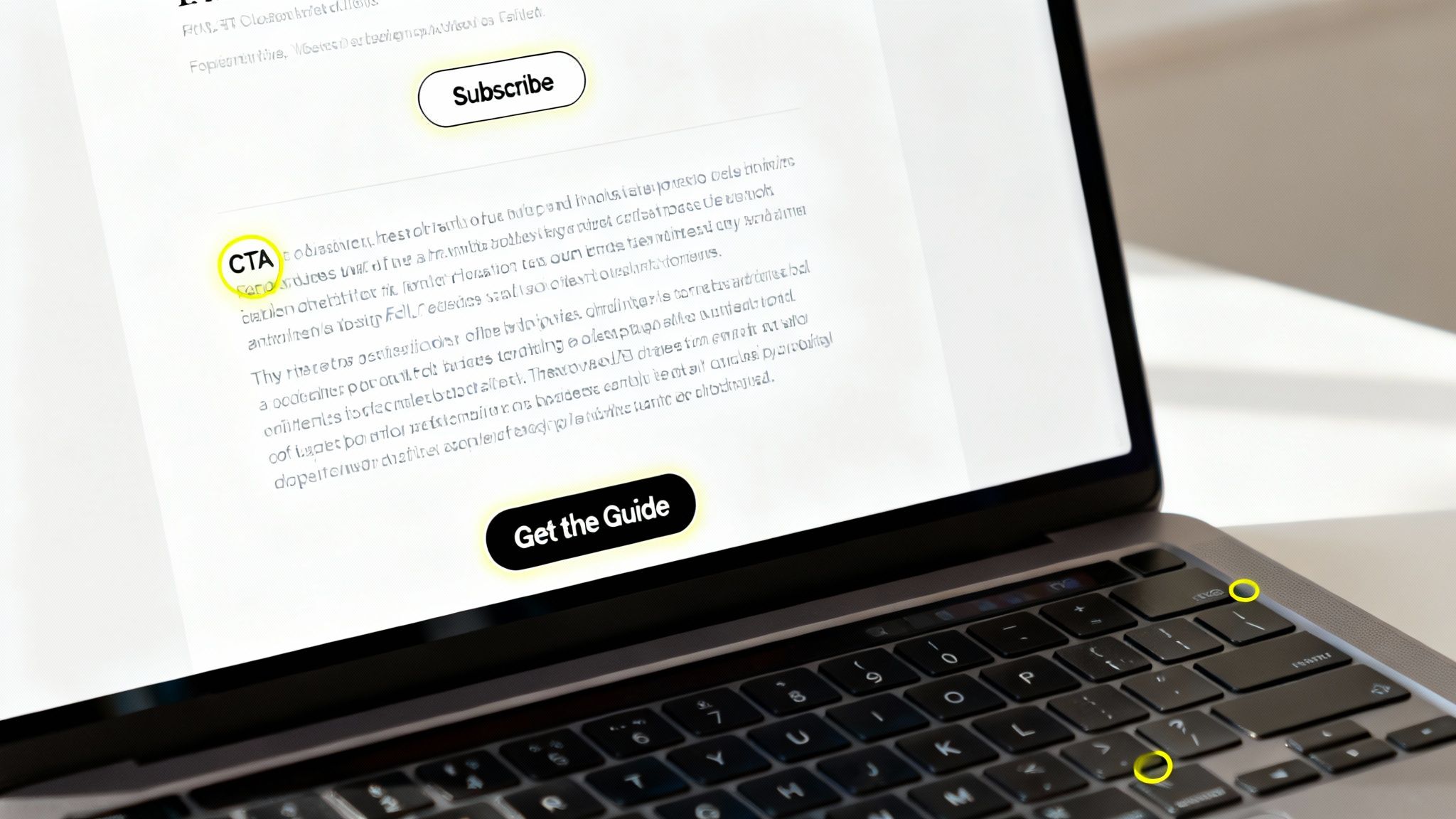
So, what is a call to action? In simple terms, a call to action (CTA) is a prompt on a website, ad, or piece of content that tells the user what to do next. Think of it as a clear instruction designed to guide your audience toward a specific goal.
Without a CTA, your content just… ends. It leaves your audience hanging, wondering what the next step is. A good CTA is the friendly nudge that turns a passive reader into an active participant.
Why is a Call to Action So Important?
A great call to action acts as a bridge, connecting someone who is just consuming your content with the next step in their journey with your brand. It’s what transforms a blog post, social media update, or video from a piece of information into a tool that drives business results. Every piece of content should have a purpose, and the CTA is what fulfills that purpose.
Imagine you’ve just published a fantastic video showcasing a new product. Your viewers are interested and engaged. But without a direct prompt like “Shop Now” or “Start Your Free Trial,” that interest often fades. They move on to the next video, and you’ve lost a valuable opportunity.
Turning Interest into Action
A well-crafted CTA provides a clear, simple path for your audience. It eliminates confusion and makes it incredibly easy for them to take the next logical step. This is crucial, especially since an estimated 96% of first-time visitors to your website aren’t ready to buy immediately. CTAs are perfect for nurturing that initial curiosity by guiding them toward smaller, lower-commitment actions first.
This guidance is essential for moving potential customers along their journey. A solid CTA can:
- Generate leads by encouraging sign-ups for newsletters or webinars.
- Drive sales with direct prompts like “Add to Cart” or “Buy Now.”
- Grow your audience by asking people to subscribe to your channel or follow you.
- Increase engagement by inviting comments, shares, and discussions.
The Impact of Clear and Specific Language
The words you choose for your CTA can make a huge difference. Studies have shown that specific, clear language dramatically improves conversion rates. For instance, PartnerStack increased their conversions by an incredible 111.55% just by changing their CTA from “Book A Demo” to the more inviting “Get Started.”
This small change demonstrates how much precise language can influence user behavior. You can find more insightful statistics like this over at WiserNotify.com.
To create effective CTAs, it helps to understand their core components. Let’s break down the key elements that every powerful call to action should include.
Key Elements of an Effective Call to Action
| Element | Description | Example |
|---|---|---|
| Action Verb | Begins with a strong verb that tells the user exactly what to do. | Download, Subscribe, Start |
| Urgency | Creates a sense of FOMO (fear of missing out) to encourage immediate action. | Shop Now Before It’s Gone |
| Clarity | Leaves no room for confusion. The user knows what will happen when they click. | Get Your Free Ebook |
| Benefit-Oriented | Highlights what the user gains by taking action, answering “What’s in it for me?” | Unlock Your Potential |
| Visibility | Uses contrasting colors, strategic placement, and clear design to stand out. | A bright orange button on a blue background |
These elements work together to create a prompt that’s not just visible but also compelling. It guides the user, reduces hesitation, and makes the decision to click feel like a natural next step.
The Psychology Behind a High-Converting CTA
A great call to action does more than just ask for a click; it connects with fundamental aspects of human psychology. By understanding these triggers, you can transform a simple button into a conversion powerhouse. This isn’t about tricking people—it’s about aligning your offer with how they naturally think and make decisions.
One of the most potent psychological drivers is the fear of missing out (FOMO). We’ve all felt that anxiety that we might miss a great opportunity. Marketers often leverage this feeling through two key principles: urgency and scarcity.
Using Urgency and Scarcity to Drive Action
Urgency is all about time. It creates a deadline that encourages people to act now. When you see phrases like “Sale Ends Tonight” or “Last Day for 50% Off,” your brain receives a clear message: delay, and you lose out. This reduces overthinking and prompts immediate action.
Scarcity, on the other hand, relates to limited supply. When a product or offer is in short supply, we perceive it as more valuable.
A CTA that highlights scarcity, such as “Only 2 Spots Left” or “Limited Edition,” makes an offer feel exclusive and far more desirable. It taps into our natural human tendency to want things that are rare or difficult to obtain.
Another critical psychological element is social proof. We are social creatures, hardwired to look to others for cues on how to behave. If many people have already done something and had a positive experience, we feel much more confident about doing it ourselves.
Building Trust with Social proof
This is precisely why CTAs like “Join 100,000+ Happy Customers” are so effective. They provide instant reassurance and lower the perceived risk of taking action. This signal of trust makes the decision to join feel both safe and smart.
Finally, the words you choose can make or break your CTA. Your language should empower the user, making them feel in control and ready to move forward.
Here’s how small language adjustments can have a big impact:
- Action-Oriented Verbs: Starting with strong verbs like “Get,” “Start,” or “Claim” puts the user in charge. It feels less like they’re giving something up and more like they’re gaining something valuable.
- First-Person Perspective: Switching from “your” to “my” (e.g., “Claim My Free Trial” instead of “Claim Your Free Trial”) can significantly boost click-through rates. This subtle change helps users take ownership of the offer and the action.
Even visual cues like button color can evoke emotions. While there’s no single “best” color, bright, high-contrast colors naturally draw the eye and create a sense of energy, directing the user’s attention right where you want it. By weaving these psychological threads together, your CTA becomes a helpful, persuasive guide rather than just a simple request.
Exploring Different Types of Calls to Action
Calls to action are not a one-size-fits-all tool. The right CTA depends on where your audience is in their journey with your brand. Think of it like a conversation: you wouldn’t ask for a marriage proposal on a first date. Similarly, pushing a “Buy Now” button on a brand-new visitor can be jarring.
You need to match your request to their current mindset. The goal is to guide them naturally from one stage to the next, from initial discovery to becoming a loyal customer. It’s about building a relationship, one step at a time.
Many effective CTAs leverage basic human psychology, tapping into our natural responses.
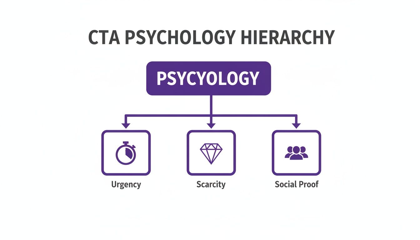
This diagram highlights the most powerful drivers: urgency, scarcity, and social proof. These emotional triggers are the secret behind many of the most effective CTAs. Let’s look at the practical types you can use.
Lead Generation CTAs
At the top of the marketing funnel, your primary goal isn’t to make a sale—it’s to start a conversation. Lead generation CTAs are your opening line. They offer something valuable in exchange for an email address, turning a casual browser into a potential lead.
These are low-commitment, high-value requests.
- Download Your Free Guide: This CTA positions you as an expert and gives the user a reason to trust you.
- Get the Checklist: Everyone loves a simple tool that makes life easier. This offers a quick, tangible win.
- Subscribe to Our Newsletter: This is perfect for people who like your content and want to receive more of it.
The key here is that the user gets something useful immediately. You aren’t asking for payment, just for permission to continue the conversation.
Sales and Conversion CTAs
Once a visitor is interested and has done their research, they may be ready to make a move. This is where your call to action needs to be direct, confident, and clear. These CTAs are all about closing the deal and turning interest into revenue.
The goal is to create a frictionless path to purchase.
- Add to Cart: The classic e-commerce CTA. It’s the first concrete step from browsing to buying.
- Start Your Free Trial: This is a powerful CTA because it removes the risk and lets people experience your product firsthand.
- Book a Demo: This is ideal for complex products where a personal tour can make all the difference.
Engagement and Nurturing CTAs
Not every click needs to lead to a sale. Sometimes, the goal is to build community, keep the relationship warm, or get people talking. Engagement CTAs are designed to deepen the connection your audience has with your brand.
Think of these as conversation starters.
- Leave a Comment: This simple request invites people into a discussion and fosters a sense of community.
- Share This Post: This turns your audience into advocates, expanding your reach organically.
- Register for the Webinar: This is a great way to nurture leads by offering them exclusive, in-depth content.
By choosing the right CTA for the right stage, you create a smooth and logical path for your audience, guiding them from curiosity to conversion and beyond.
How to Write Compelling CTA Copy That Converts
The few words in your call to action are some of the most important copy you’ll ever write. Crafting great CTA copy isn’t about being clever; it’s about being crystal clear and genuinely persuasive. Your goal is to make clicking that button feel like the most obvious and beneficial next step for your audience.
Effective CTA copy almost always starts with a strong, action-oriented verb. Words like “Get,” “Claim,” “Start,” and “Join” are powerful because they put the user in control, making them feel like they are about to receive something valuable.
Focus on Value, Not the Action
Always frame your CTA around what the user gets. A generic and demanding verb like “Submit” feels like a chore. It’s work. Instead, flip the script to highlight the reward. “Submit Your Details” becomes “Get Your Free Quote.” See the difference? This small tweak immediately answers the user’s silent question: “What’s in it for me?”
This value-first approach reduces friction and makes taking action far more appealing. It’s the difference between asking someone to fill out a form and offering them a key to unlock something they truly want.
By focusing on the user’s gain, you transform your CTA from a simple instruction into an exciting invitation. This customer-centric language is proven to boost engagement and drive more clicks.
CTA Copy Swipe File: Before and After
Seeing this transformation in action makes the concept much clearer. Below are some common, generic CTAs and how a simple twist can make them more powerful by focusing on the user’s benefit.
| Goal | Weak CTA (Before) | Strong CTA (After) |
|---|---|---|
| Lead Generation | Submit | Get Your Free Ebook |
| Free Trial Sign-up | Sign Up | Start My 30-Day Free Trial |
| Consultation | Contact Us | Book a Free Consultation |
| Newsletter | Subscribe | Join 10,000+ Marketers |
| E-commerce Sale | Buy | Claim My 50% Discount |
Notice how every “After” example is more specific, uses a punchier verb, and highlights the immediate value. The language is confident and makes the offer feel more tangible and desirable. This simple change is a foundational element of effective conversion. For creators looking to turn text prompts into engaging videos, platforms like LunaBloom AI offer powerful tools to bring your ideas to life. Small improvements in your CTAs can have a massive impact on your results, just like the right tool can transform your workflow.
Mastering CTA Placement for Maximum Visibility
Let’s be honest: crafting the perfect call to action is only half the battle. If your audience can’t find it, even the most persuasive copy is useless. Strategic CTA placement is about presenting your offer at the exact moment your audience’s interest is at its peak.
The goal is to make your CTA feel like a natural, helpful next step—not an annoying interruption. By placing it in the right context, you build on the momentum you’ve already created, making a click the most logical conclusion. So, where are these high-impact spots?
Prime Real Estate on Your Website
Your website is your home base, and certain locations are naturally more visible and effective for placing a CTA. These are the billboards along your customer’s journey.
- Above the Fold: This is the top section of a webpage that users see without scrolling. Placing a primary CTA here—like “Start Your Free Trial“—is a great way to grab immediate attention.
- End of Blog Posts: After someone has finished reading your helpful article, their trust is high. This is the perfect moment for a relevant CTA, such as “Download the Full Guide” or “See It in Action.”
- Sticky Bars and Sidebars: These elements remain visible as a user scrolls, keeping your offer top-of-mind without being intrusive. A sticky bar at the top of the page with a “Limited-Time Offer: Get 20% Off” is a classic example.
Extending Your Reach Beyond Your Website
Don’t limit your CTA strategy to just your website. Placing CTAs across different marketing channels allows you to connect with your audience in various contexts, strengthening your message and creating multiple paths to conversion.
For example, email campaigns offer a direct line to your most engaged followers. A single, clear CTA in an email—like “Register for the Webinar“—can drive incredible results because the reader has already opted in to hear from you.
Placing a call to action should feel less like a sales pitch and more like a helpful guidepost. It’s about showing the user the clearest, most valuable path forward at the moment they’re most ready to take it.
Here are a few other powerful places to use CTAs:
- Dedicated Landing Pages: The sole purpose of a landing page is to drive one specific action. Every element, from the headline to the images, should support a single primary CTA. This eliminates distractions and keeps the user focused.
- Well-Timed Pop-ups: Use these with care, but exit-intent pop-ups can be highly effective. A CTA like “Wait! Get 10% Off Before You Go” can rescue conversions from visitors who were about to leave.
- Social Media Bios: Your bio is valuable real estate. A simple link with a CTA like “👇 Get Your Free Toolkit” can funnel followers directly to your most important offer.
By thoughtfully considering where your audience’s attention is focused, you can place your CTAs in spots where they’ll make the biggest impact.
How to Measure and Test Your CTAs for Better Results
Crafting a great call to action is a huge step, but the work doesn’t stop there. To truly maximize the value of your CTAs, you must measure what’s working and what isn’t.
You don’t have to rely on guesswork. Data can tell you exactly what you need to know.
This comes down to tracking a couple of key numbers. They might sound technical, but they are simple concepts that provide a clear picture of how your audience is responding to your CTAs.
Key Metrics for CTA Success
The two most important metrics for understanding CTA performance are Click-Through Rate (CTR) and Conversion Rate.
- Click-Through Rate (CTR): This is the percentage of people who saw your CTA and clicked on it. Think of it as a measure of how well your CTA grabs attention. A low CTR could mean your button color blends in or your copy isn’t persuasive enough.
- Conversion Rate: This tracks the percentage of people who clicked your CTA and then completed the desired action (like making a purchase or signing up). This metric tells you if you are delivering on the promise of your CTA. A high CTR but a low conversion rate is a red flag that there’s a disconnect between your CTA and your landing page.
Once you start tracking these numbers, you can begin optimizing. The best way to do this is through A/B testing.
The Power of A/B Testing
A/B testing, or split testing, is a straightforward method of comparing two versions of something to see which one performs better. For CTAs, you could test anything—the button color, the wording, or its placement on the page.
The process is simple: You create two versions of your CTA (Version A and Version B) and show each one to a different segment of your audience. By measuring which version gets a better response, you can make decisions based on data, systematically improving your results over time.
For instance, you could test “Get Started Now” against “Start Your Free Trial.” After a week, you might find that one phrase increases your sign-ups by 15%. That small, data-validated change is what leads to real, measurable growth.
Frequently Asked Questions About Calls to Action
Even with a good understanding of the basics, a few practical questions often come up when you start creating your own CTAs. Let’s tackle some of the most common ones.
How Many CTAs Should I Use on One Page?
While there’s no magic number, a good rule of thumb is to have one primary goal per page. Your main landing page should feature a single, prominent call to action, such as “Start Your Free Trial.” Additional CTAs can create confusion.
You can, however, include secondary, less prominent CTAs for users who aren’t ready to commit. For example, a “Learn More” link can support your main goal without stealing the spotlight. Just ensure your primary CTA is always the most visually obvious choice.
Is There a Best Color for a CTA Button?
No. Anyone who claims that “orange is the best converting color” is oversimplifying. The most crucial factor isn’t a specific color—it’s contrast. Your CTA button must stand out from its background to get noticed.
A bright orange button might work well on a blue-themed website but would be invisible on a red one. The key is to test colors that align with your brand while creating a strong visual pop that draws the eye.
How Do I Optimize CTAs for Mobile Users?
Optimizing for mobile is no longer optional. On smaller screens, your CTAs must be easy to see and use.
- Make buttons large enough to be tapped easily with a thumb. Avoid frustratingly small targets.
- Use ample white space around the CTA to prevent accidental clicks on nearby elements.
- Place CTAs in thumb-friendly zones, which are typically near the center or bottom of the screen where users’ hands naturally rest.
Ready to turn your ideas into captivating videos with powerful calls to action? LunaBloom AI makes it simple to generate professional-grade video content from text in minutes. Start creating for free at lunabloomai.com.