You can have a clean concept, a polished edit, and a decent media budget, and still watch the campaign stall because the video was built for the wrong moment. That's the part many overlook with social media ads video; the problem is rarely the footage alone, it's the mismatch between audience state, offer, placement, and the job the ad is supposed to do.
A strong paid social video isn't just a moving version of a static ad. It has to earn attention fast, match the platform's native behavior, and push one clear action without confusing the viewer. In practice, that means choosing the right format before you open the editor, then shaping the hook, pacing, and proof so the creative can carry the bid event you care about.
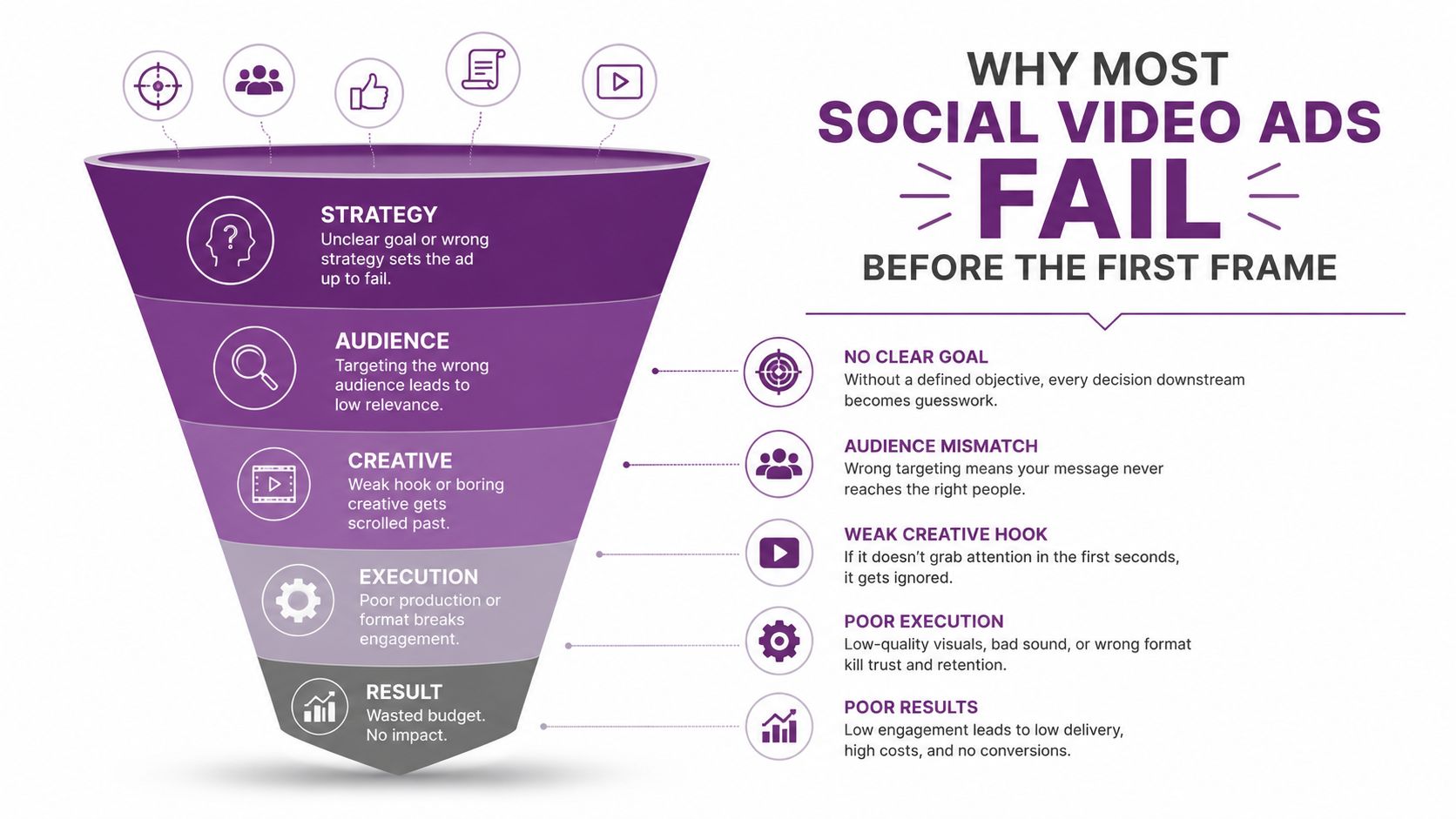
Why Most Social Video Ads Fail Before the First Frame
The most common failure happens before the edit. A marketer uploads a polished 60-second hero film, expects the algorithm to sort it out, then wonders why CPM rises and the creative gets buried in the feed. The ad did not lose because it looked bad, it lost because the audience state and the conversion job were never defined clearly enough to support the asset.
That gap is widening as video takes a bigger share of paid social. The Future Market Insights report on social video advertising growth points to strong expansion in the category, which means more advertisers are competing for the same attention with the same generic creative pattern. LunaBloom AI's about page makes a similar point from a workflow angle, teams move faster when the creative brief is tight before production starts. Growth does not fix weak strategy. It makes vague briefs more expensive.
The four questions that gate every brief
Before production, every brief should answer four things in plain language:
- Who is this for right now? Cold audiences need fast problem framing and a clear pattern interrupt. Warm audiences can handle mechanism, proof, and comparison. Retargeted viewers usually need objection handling and a tighter offer.
- What action should this creative engineer? If the ad is meant to drive traffic, do not write a conversion close that assumes purchase intent. If the goal is conversion, do not spend half the runtime on broad awareness language.
- Where does this ad sit in the sequence? A first-touch hook should not do the work of a retargeting asset. If the previous variant already established the problem, this one should move to proof, demo, or offer.
- Does the hook, promise, and proof appear in that order? If the ad buries the hook behind setup, it is already behind.
Practical rule: if you cannot say the audience, the offer, and the next step in one sentence, the creative brief is still too vague.
Campaign objective changes the metric that matters. Reach and video view campaigns reward early attention and cheap distribution. Traffic campaigns reward click intent. Lead and conversion campaigns reward downstream action, not just watch time. A strong-looking video can still be wrong for the bid event if the objective does not match the creative's actual job.
Funnel fit by creative stage
Cold awareness creative should act like a blunt instrument, a 3-second hook, a visible problem, and enough context to keep the viewer watching. In that phase, 6 to 10 seconds is often enough if the hook is sharp and the offer is obvious.
Mid-funnel consideration can stretch to 15 to 30 seconds when the creative needs a mechanism reveal, a side-by-side comparison, or a product demo. Retargeting and decision-stage ads can run 20 to 45 seconds when they stack objections, testimonials, and urgency around a specific offer.
The hybrid rule matters too. A static ad, a UGC carousel, or a product card will sometimes beat video on a specific objective, especially when direct response matters and the product can be understood faster without motion. If a still image explains the offer faster than a video, use the still image and move on.
A quick decision tree solves more bad briefs than a long workshop:
- Cold audience? Lead with the problem and a hard visual interrupt.
- Warm audience? Show the mechanism, the proof, or the comparison.
- Retargeting? Use objections, testimonials, or offer pressure.
- Need clicks more than watch time? Tighten the length and front-load the CTA path.
- Could a static or carousel explain it faster? Use that instead.
If a brief fails any of those checks, the problem is upstream. Rewrite the creative direction before anyone starts filming.
Writing a Script and Storyboard That Convert
The best-performing scripts already know what the viewer needs to see, hear, and understand in each beat, then build outward from that clarity. In paid social, that usually means one message per beat, one action per ad, and no extra setup that slows the first frame.
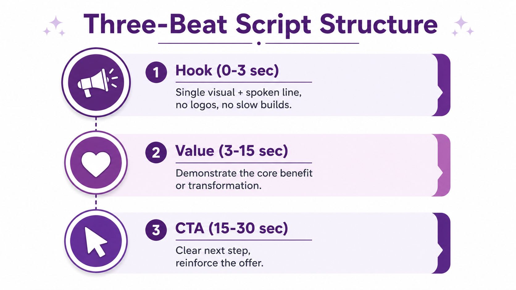
The three-beat structure, hook, body, close, gives editors something usable and keeps viewers from getting lost. It also forces trade-offs early, because every line has to earn its place.
The first line is not a warm-up. It is the ad.
The hook should land in 0 to 3 seconds with a single visual and a single spoken line. Skip logos, slow fades, and brand exposition. The body from 3 to 15 seconds should carry one idea per beat, with visible proof, screen context, or product demonstration reinforcing the message. The close in the final 3 to 5 seconds should name the action, and it should match the platform, whether that's a signup, a product view, or a message reply.
The silent-viewer problem is real. A 2024 Meta study found that over 60% of mobile video is watched without sound, so captions and on-screen text cannot be an afterthought. They need to carry the script when audio never starts.
Here's a simple fill-in template you can reuse:
- Hook: “Stop [pain point] with [category or method].”
- Body: “Here's how it works, [mechanism]. Here's what you get, [specific outcome].”
- Close: “Tap to [specific next step].”
For a SaaS brand, that becomes: “Stop losing leads in your inbox. We route every inbound form into one dashboard, so your team can respond faster. Book a demo and see the workflow.” For a DTC brand, it becomes: “Tired of breakfasts that don't hold you? This bar packs protein and tastes like an actual snack. Shop the bundle today.”
Storyboard details that editors need
A useful storyboard includes the frame count, shot type, motion direction, and caption placement for every beat. A talking head can carry trust. A screen record can prove utility. B-roll can create context. Product close-ups can make the offer feel tangible. The job is to choose the shot type that supports the claim, not the one that looks nicest in a moodboard.
For a clean production handoff, I'll often keep a storyboard to three rows:
- Shot type with a note on whether it's talking head, screen record, b-roll, or product close-up.
- Motion direction with a quick cue like push-in, side pan, or static hold.
- Caption zone so text doesn't sit on top of UI or hide the key product detail.
The biggest script killers are easy to spot. The hook gets buried behind setup. Three benefits get stacked into one sentence. The team forgets the silent viewer. If the script doesn't survive those three checks, it isn't ready yet.
Use this starter guide to turn a rough concept into a production-ready draft without turning the process into a rewrite loop.
Platform Specs and Creative Conventions Compared
Meta, TikTok, and YouTube reward different visual languages. A creative that works in one feed can feel too polished, too slow, or too informational in another. The format rules matter, but the platform convention matters just as much, because viewers arrive with different expectations on each app.
Meta's guidance for placement-specific dimensions gives advertisers two distinct targets, 1440×2560 for 9:16 placements like Reels and Stories, and 1440×1800 for 4:5 feed placements, according to a published ad-spec reference on Meta placement sizing. For file handling, independently published spec guides cite a 4 GB maximum file size, MP4/MOV support, and a duration window that can run from 1 second up to 241 minutes in some Meta placements, which shows how widely limits vary by objective and placement. TikTok in-feed video ads are commonly specified at 1080×1920, 9:16, with 5 to 60 seconds allowed and 21 to 34 seconds often used in best-performance guidance. YouTube Shorts ads are commonly specified at 9:16 with 15 to 30 second recommended lengths, and YouTube pre-roll formats can run 12 seconds to 3 minutes, with bumper ads capped at 6 seconds.
The practical takeaway is simple. Don't hand an editor one universal social video spec and expect it to fit every placement.
| Platform | Aspect Ratio | Recommended Length | Safe Zone | Sound Default | Creative Convention |
|---|---|---|---|---|---|
| Meta Feed and Reels | 9:16 or 4:5 | Short for attention, longer for retargeting | Keep captions clear of lower UI and feed overlays | Mixed, but design for sound-off first | Polished direct-response, strong on-screen text |
| TikTok | 9:16 | Short-form vertical, often tighter at the top of funnel | Leave room for UI and captions | Sound-on culture, but silent viewing still happens | Creator-style, fast hooks, native-feeling footage |
| YouTube Shorts and in-stream | 9:16 for Shorts, format-specific for in-stream | Shorts are tight, in-stream varies by format | Keep key text above lower controls | Sound expectation is higher | Clear hooks, demonstrative product shots, higher intent |
What the feeds reward
TikTok usually rewards footage created natively within the platform, with creator-style framing and fast pattern interrupts. Hooks that sound human and move quickly tend to outperform clean but overworked edits.
Meta Feed and Reels can handle a more direct-response look when the text is strong and the offer is obvious on first glance. YouTube Shorts and in-stream placements reward clearer hooks and more demonstrative shots, because the viewer often arrives with stronger intent.
For a full breakdown of supported formats and publishing settings, see the platform overview.
Producing the Ad With AI Video Workflows
AI has made video production faster, but only for teams that give the model a tight brief. If the script is muddy, the output is usually muddy in a more expensive way. If the direction is specific, AI can speed up asset generation, concepting, and assembly without forcing the team into a full studio process.
The cleanest workflow starts with the script and shot list, then moves to a reference moodboard. From there, image generation locks the visual direction before motion begins, which saves a lot of time later when the team is debating style instead of shipping work. After that, AI video generation can produce B-roll, product spins, or background scenes, and those assets can be assembled with real footage, UGC clips, or screen recordings in an editor.
For faceless brands, one useful reference is how to produce faceless video ads, especially if the campaign leans on product motion, text-led framing, or narrated visuals instead of on-camera talent.
The areas where AI still underperforms are easy to name. Human hands can look odd. On-camera authenticity still matters for certain offers. Regulated claims need careful review. Anything that must read as real should be checked by a human before it ships. AI can accelerate the build, but it shouldn't be trusted to interpret risk.
Quality control beats speed every time when the asset touches claims, price, or identity.
A practical QA pass should check four things before export:
- Brand consistency: fonts, colors, tone, and visual hierarchy match the brand.
- Legal review: no unsupported claims, misleading visuals, or missing disclosures.
- Platform fit: aspect ratio, caption placement, and duration align with the placement.
- Playback reality: subtitles, voice timing, and CTA visibility hold up on mobile.
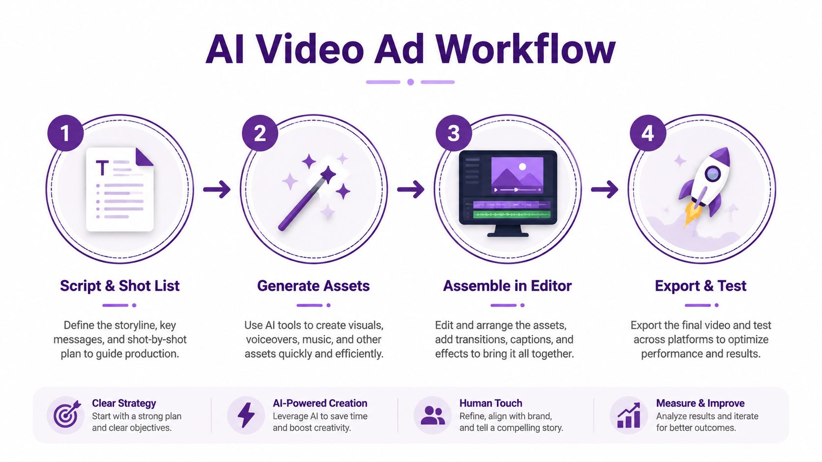
Teams that want the output voice, subtitles, and multi-format assembly handled in one place can also evaluate the app workflow alongside their existing editor stack.
Editing, Captions, and Sound Design That Lift Completion
The edit is where raw footage becomes a paid media asset. A lot of campaigns die here because the first thing the viewer sees is a logo, a soft fade, or some ambient setup that assumes patience. Paid social doesn't give you patience.
The first 3 seconds should lead with the strongest visual, the clearest benefit, or a pattern interrupt. On TikTok and Reels, cutting on motion every 1.5 to 2.5 seconds keeps momentum up, while YouTube in-stream can usually breathe a little more. That rhythm matters because completion is a function of pacing as much as message.
Burn captions directly into the frame with a high-contrast sans-serif treatment sized for mobile. Keep them out of the lower-third zone so usernames, UI, and CTAs don't fight each other. If you need to choose between a clever caption and a legible one, choose legible.
Sound and motion without overediting
Motion design should support the message, not call attention to itself. Kinetic typography, small zoom punches, and color pops can pull focus to the offer or objection, but flashy transitions usually make the ad feel more like content marketing than direct response. The viewer doesn't need a fireworks show, they need clarity.
For audio, mix for sound-on first, then build the captioned version for silent autoplay. A soft music bed sitting under the voice keeps the edit from feeling dead without drowning the narration. Accessibility also matters, so every spoken line should have captions, and fast flashing should be avoided.
A simple completion checklist looks like this:
- Open with movement: no static logo intro.
- Keep typography readable: large enough for a phone screen.
- Use one accent pattern: don't stack three motion styles in one cut.
- Check for accessibility: captions, timing, and no distracting flashes.
A/B Testing and Localization Across Markets
Random creative swaps waste data. Good testing isolates one variable at a time so you can tell whether the hook, the body, or the CTA is moving the result. If you change everything at once, you learn nothing useful, and the next round of edits turns into guesswork.
Start by testing the hook first. Keep the body and CTA constant, then swap only the first three seconds. Once the hook winner is clear, move to the body. Once the body is stable, test the CTA. A clean test grid keeps the creative team from arguing about vague feelings and forces decisions around one lever at a time.
| Variable to Test | Expected Lift Range | Min. Sample per Arm | Decision Window |
|---|---|---|---|
| Hook | Qualitative, often the fastest signal source | Enough daily impressions to read 3-second behavior | 48 hours or until stable pattern emerges |
| Body | Qualitative, usually slower than hook | Enough traffic to reach mid-funnel behavior | After the hook winner is locked |
| CTA | Qualitative, depends on intent level | Enough conversions or strong proxy activity | After body variation is isolated |
Localization works best when you preserve the winning structure and swap what the market sees first. That usually means dubbing or caption replacement, adapting on-screen text, changing product demos to fit regional norms, and reframing the offer in local language. If a creative already works in one market, often the fastest path is to keep the core edit and swap the first three seconds and CTA for the new geo.
One operational note matters here. UI and UX labels inside the ad or landing page should match the language and conventions of the market you're targeting. If the interface or product flow feels translated but not localized, conversion friction creeps in before the viewer even reaches the checkout step.
This practical testing and iteration guide is handy for teams that want to organize experiments without turning localization into a one-off translation job.
Measuring What Matters and When to Stop Spending
A volume-first mindset fills feeds with noisy creative and empty vanity metrics. The better approach is to watch the signals that tell you whether the ad is earning attention and moving people toward a sale. Hook rate, hold rate, thumbstop ratio, CPA by creative quartile, and incremental lift vs. holdout tell a much cleaner story than views alone.
Start with the hook rate. If the first three seconds don't hold attention, nothing downstream matters. Then read the retention graph and look for the exact frame where people drop. If the loss happens on the claim, the offer, or the first product reveal, that's your rewrite point. If the hold is fine but CPA is weak, the problem may be offer fit or landing-page continuity instead of the edit itself.
The source on optimizing marketing spend with ROAS is useful background when you're comparing creative efficiency against actual revenue outcomes, because ROAS only helps when you pair it with creative-level diagnosis. That's where budgeting decisions get made.
When to cut, when to iterate
Stop spending when the pattern says the creative is done. Rising CPM paired with falling hook rate usually means the ad is getting less efficient as it ages. If a creative has been live too long without rotation, fatigue creeps in. If CAC is more than 20% above LTV, the campaign needs a hard rethink, not a minor bid tweak.
A weekly cadence keeps the system moving:
- Monday, creative review and kill list. Pull retention, CTR, CPA, and frequency, then pause the weak assets.
- Tuesday and Wednesday, new hook production. Draft fresh angles, build new opening beats, and keep the body stable where possible.
- Thursday, variant assembly and QA. Check captions, safe zones, timing, and platform fit.
- Friday, launch and allocate test budget. Push new variants into controlled cells.
- Next Monday, read results and iterate. Promote winners, cut losers, and write the next round from the data.
The role split should stay sharp. The strategist owns the brief and the metrics. The editor owns assembly, captions, and pacing. The media buyer owns rotation rules, budget shifts, and kill thresholds. When those jobs blur together, spending gets sticky and performance stalls.
If you want one concrete move this week, pull last quarter's best static ad, brief a 9-second vertical video version with three hook variants, and ship it into a $50/day test cell. That gives you a clean read on whether motion beats stills for that offer without committing the whole budget to a hunch.
LunaBloom AI helps teams turn scripts, prompts, and images into export-ready social videos with voiceovers, captions, and one-click publishing, which makes it a practical fit for paid social teams that need to move from brief to test asset quickly. If you're building social media ads video workflows and want a faster way to produce, localize, and iterate creative, visit LunaBloom AI and see how it fits into your next testing cycle.