Most explainers don't fail because the animation is weak. They fail because they explain how something works before anyone cares why it matters. The proof that the reverse order works is hard to ignore. Metro Trains Melbourne's animated safety song reached more than 44 million YouTube views within five months, according to the history of Dumb Ways to Die, because it sold one behavior through characters and a hook, not instructions.
That's the pattern across the strongest animated explainer video examples. One message. A reason to care in the first ten seconds. Visuals that arrive exactly when the narration needs them, never as decoration running ahead of the script.
The eight examples below each solve a different problem, from teaching a brand new product to carrying a full school subject. Each gets a producer's teardown covering what the format does well, where it breaks down, and how you'd rebuild the effect with AI video tools.
If you want the broader production framework first, this animated explainer video guide covers planning and delivery in depth. Here, we're going straight to the work itself and what you can steal from it.
1. Common Craft Twitter in Plain English
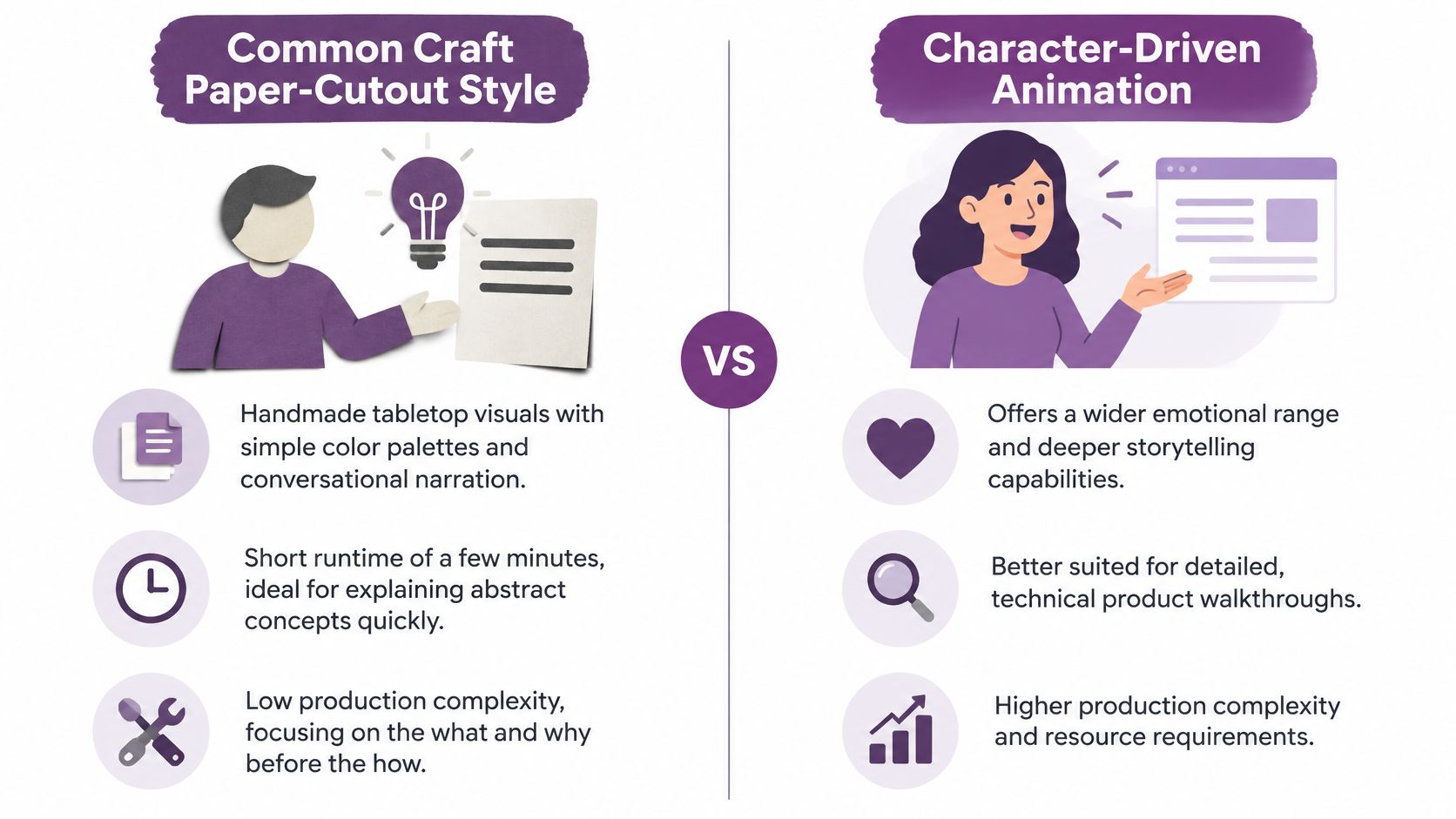
Common Craft's Twitter in Plain English from 2009 is paper cutouts on a table, a hand sliding them around, and Lee LeFever talking like a patient friend. No interface tour, no feature list. The video explains what Twitter feels like to use, using everyday situations, and trusts the viewer to fill in the rest.
It worked because the format removes intimidation. Paper can't look technical, so the subject doesn't either. The wider Plain English library, including Wikipedia in Plain English, used the same tabletop grammar for business and education topics, and the style got copied so widely it became a genre.
Where It Breaks Down
Paper cutout charm caps your ceiling. You can't show a real workflow, and the handmade look reads as low budget to enterprise buyers who equate polish with credibility. It also dates fast once the product changes, since every visual is physical.
Practical rule: If you can't state the problem in one sentence a stranger would repeat back to you, the script isn't ready, whatever the style.
Recreate It
- Lead with one sentence: Name the core problem before naming your product.
- Cut every jargon word: If a term needs explaining, replace it with a familiar comparison.
- Draft fast: Use a text to video starter workspace to turn a short conversational script into simple narrated scenes, then judge the pacing before adding polish.
- Close with one action: End on a single next step, not three.
Say a bakery software tool explains online ordering this way. One paper baker, one ringing phone, one calmer morning. The viewer gets the why in under a minute.
2. RSA Animate Drive by Dan Pink
RSA Animate takes a recorded talk and has an illustrator draw it live, in fast forward, on a whiteboard. The 2010 adaptation of Dan Pink's Drive: The Surprising Truth About What Motivates Us is the reference point. Pink talks about autonomy, mastery, and purpose, and your eye is busy following the pen, so your ear stays with the argument.
The trick is synchronization. Each idea lands visually at the moment the speaker says it, so you're never reading ahead or catching up. Research heavy material that would die as a talking head becomes something you can follow almost physically.
Where It Breaks Down
Whiteboard drawing strains over long runtimes. Fine marker detail disappears on a phone, and text written on the board is useless for anyone watching small or without sound. This matters more than most producers plan for. Survey evidence summarized in recent video content statistics says 80% of viewers are more likely to complete a video with subtitles, so captioned versions aren't an afterthought, they're a completion lever.
Recreate It
Map one visual metaphor per major point before you record anything. Sync each visual change to a natural pause in the narration. For thought leadership, take a webinar or talk you already have and cut it to a two to four minute animated recap using a script to video workflow, keeping only the three strongest claims.
A consultant with a recorded keynote can rebuild one segment this way as a standalone clip for social distribution, with captions and multilingual subtitles baked in from the start rather than translated later.

3. Kurzgesagt In a Nutshell The Egg
Kurzgesagt built a loyal audience on flat illustration, rounded shapes, calm narration, and relentless consistency. The Egg, A Quest for the Meaning of Life from 2016 takes a short story about existence itself and makes it feel like a gentle conversation. Big idea, small cast, no urgency in the voice at all.
The lesson for brands isn't the philosophy. It's that a recognizable visual system compounds. Every video in the library looks like it belongs to the same world, so returning viewers settle in instantly and new viewers can identify the channel from a single frame in a feed.
Where It Breaks Down
This polish is expensive and slow in traditional production, and the style is so distinctive that copying it closely makes your video look like a tribute act. It also suits curiosity driven topics better than urgent, instruction heavy ones, where viewers want steps, not atmosphere.
Recreate It
- Fix your visual rules once: Palette, shapes, and typography stay identical across every video.
- Open with a question: A surprising fact or genuine puzzle earns the first ten seconds.
- Reuse a template system: Start new episodes inside an app workspace with premium templates so layered audio and brand styling carry over instead of being rebuilt.
- End with a takeaway: One sentence the viewer can repeat at dinner.
Say an astronomy club runs a monthly series on this model. Same narrator, same palette, one question per episode. Recognition does the marketing for them.

4. TED-Ed Lessons
TED-Ed, launched in 2012, packages one concept into roughly five minutes of custom animation, then adds a quiz or discussion prompt. That second part is the innovation. The video isn't the whole product. It's the front half of a learning unit, which is why teachers and corporate training teams keep adopting the format.
Each lesson is built around a single learning objective. Not a topic, an objective, something the viewer should be able to do or explain afterward. Writers who skip that discipline produce interesting videos nobody retains.
Where It Breaks Down
Custom animation per lesson doesn't scale cheaply, and a beautiful lesson with no follow up activity behaves like entertainment. Accessibility also gets skipped under deadline pressure, which is a compliance problem, not a nicety. W3C captioning guidance requires captions covering spoken dialogue, sound effects, and other meaningful audio, synchronized with the events they represent, plus audio description when key information is purely visual.
Recreate It
Structure every video as objective, explanation, check. Add a short quiz or reflection question at the end to force recall. Multi character dialogue works well here, since a simulated teacher and student conversation surfaces the misconceptions a straight narration glosses over.
Health education benefits from exactly this structure. A lesson modeled on teaching students lifelong virus prevention skills can pair one animated explanation of transmission with three scenario questions, then localize the same lesson across languages and regional accents for different classrooms.
5. Khan Academy Handwritten Video Lessons
Sal Khan started in 2008 with a digital pen, a dark background, and his own voice working through problems one step at a time. It looks like almost nothing. That's precisely why it teaches so well. The viewer watches thinking happen at writing speed, and writing speed is close to learning speed.
Compare that with a polished animation that reveals a finished equation in one elegant move. The polished version shows the answer. Khan's version shows the path to the answer, false reassurance removed. Software and training teams still copy this whiteboard approach for anything procedural.
Where It Breaks Down
Handwritten pacing punishes rambling. If the narrator circles back or over explains, viewers leave, and there's no visual spectacle to hold them. Length discipline matters here. HubSpot marketing statistics report that videos under one minute average a 50% engagement rate, which is a benchmark average, not a promise, but it underlines why each step needs its own short scene.
The format in action looks like this, pen, voice, and one idea at a time.
Recreate It
Keep each video under about five minutes and give every step its own scene. Voice cloning keeps one consistent instructor voice across a full tutorial series, which matters when you're producing dozens of lessons. The team background behind that kind of tooling is covered on this about page. Add automatic subtitles, since learners often watch in noisy shared spaces where audio alone won't carry.
6. Vox Explainers
Vox built its reputation from its 2014 launch on making dense subjects, policy, economics, culture, digestible in minutes. The formula is a sharp script, animated charts, clean icons, and on screen text restating the takeaway. You're never asked to hold a number in your head while a new one arrives.
The discipline is one data point per scene. Most brand videos fail here by animating a whole dashboard at once, which looks impressive in a boardroom and reads as noise on a phone.
Where It Breaks Down
Speed creates risk. Fast paced narration over statistics invites errors, and one wrong figure damages the credibility the format is built on. Cite sources in the description so viewers can verify claims, and treat every chart as a factual assertion that needs checking, not a design element.
Discovery is the other weak point producers ignore. Google's video search guidance says a video should sit on an indexed watch page with a crawlable standard player, structured data, and a unique thumbnailUrl, name, and description matching the actual content. Skip that and your explainer is invisible to search however good it is.
Recreate It
- One chart per scene: Animate what changed, nothing else.
- Restate the takeaway as text: Assume muted autoplay.
- Publish for search: Automated SEO titles, descriptions, and thumbnails help data driven explainers rank instead of relying on shares.
Say an analyst explains a pricing shift to customers. Three scenes, three numbers, one conclusion. That's the Vox skeleton, and it fits a product update as well as a news story.

7. Moz Whiteboard Friday
Whiteboard Friday ran for years on an almost stubbornly simple idea. One presenter, one whiteboard, one SEO question per episode. Rand Fishkin hosted early on, later presenters took over, and the format survived the handover because the format was the brand, not the person.
That repeatability is the strategic point. A fixed set, a fixed structure, and a weekly slot turned individual explainers into a library, and libraries compound in search in ways one off videos never do.
Where It Breaks Down
A person at a whiteboard can't show software workflows or physical products, and the format lives or dies on presenter energy. It also produces volume before it produces results, which teams underestimate. The commercial case for persistence is real though. A Crazy Egg explainer case study reports a 64% conversion rate increase and approximately $21,000 in additional monthly revenue after adding a short animated video to a landing page. Those are client reported figures, so treat them as a reason to run your own controlled test, not as a guarantee.
Recreate It
Choose one specific question per video, something your audience types into search. Publish on a fixed schedule so returning becomes habit. If you can't record live every week, avatar and voice tools can hold a consistent presenter together, and the economics of doing that at volume are laid out in current plan pricing.
Repurpose each episode into a short social clip and a blog post. Say an agency answers one client question every Friday this way. Within a quarter it owns a searchable FAQ library that also feeds its sales calls.
8. Crash Course
Crash Course, launched in 2012 by John and Hank Green, does the thing most educators are told not to do. It goes fast. Roughly ten minutes per episode, dense narration, animated diagrams and character sketches keeping pace, covering world history, biology, literature, and more as full series.
Speed works here because the visuals carry real information. When narration accelerates, the graphics simplify, so cognitive load stays flat even as word count climbs. Weaker copycats speed up the voice and keep busy visuals, and viewers drown.
Where It Breaks Down
Ten fast minutes is a lot to retain without navigation help, and long form punishes weak structure. Duration decisions deserve actual measurement. Wistia's video marketing statistics define average engagement as the percentage of a video watched on average, and report that longer form can still perform when the content justifies it. Judge your episodes on that number, not on runtime alone.
A series beats a marathon. Ten tight episodes get finished, shared, and searched. One long video gets bookmarked and forgotten.
Recreate It
- Plan a series, not a single video: One concept per episode, sequenced like a course.
- Lock the furniture: Same intro, visual style, and sign off every time builds recognition.
- Add chapter markers and subtitles: Long form without navigation loses returning viewers.
- Localize early: Translation into 50+ languages turns one series into an international catalog.
Say a training provider rebuilds an onboarding manual as twelve short episodes. New hires finish them, managers can assign individual chapters, and updates mean reshooting one episode, not the whole course.
The 8 Animated Explainer Video Examples at a Glance
| Visual Style | Best For | Production Complexity | Key Takeaway |
|---|---|---|---|
| Handmade paper cutouts on a tabletop with friendly narration | Making new or abstract concepts easy to understand | Low | Keep the explanation short, simple, and focused on what and why |
| Hand-drawn sketches timed to spoken narration | Thought leadership and educational talks | Moderate | Use visual metaphors to make complex arguments memorable |
| Polished flat illustrations with cinematic movement and story-driven narration | Engaging broad audiences with science, philosophy, or big ideas | High | Strong storytelling and a consistent visual style build audience connection |
| Custom animation paired with a focused lesson and follow-up questions | Classroom learning and corporate training | Moderate to high | Center each video on one learning objective and reinforce it with a prompt |
| Digital handwriting and whiteboard-style diagrams | Step-by-step tutorials in math, science, and other subjects | Low | Show one clear step at a time, like a personal tutor |
| Motion graphics, animated charts, maps, and on-screen text | Explaining data-heavy news, policy, or business topics | High | Simplify and verify information, using visuals to clarify key points |
| Presenter-led whiteboard diagrams with conversational narration | Practical marketing and SEO education | Low to moderate | A simple, repeatable format works well for focused professional lessons |
| Fast narration, animated graphics, diagrams, and humor | Multi-part educational series on broad subjects | High | Use energetic pacing and a consistent visual system to make dense topics engaging |
Steal the Pattern, Not the Video
Eight different formats, one shared skeleton. Common Craft, RSA Animate, Kurzgesagt, TED-Ed, Khan Academy, Vox, Moz, and Crash Course all commit to one message per video. Every attempt to explain two things at once produces a video that explains neither and gets described in meetings as unfocused, which is producer language for unfocused.
The second shared trait is the opening. Each example gives you a reason to stay within seconds, a question, a problem, a surprising claim. Demand supports the effort too. Wyzowl's video marketing statistics report that in 2024, 89% of people said they wanted to see more video from brands, so audiences aren't resistant to explainers. They're resistant to slow ones.
The non negotiable sequence: Problem first, mechanism second, proof third, one action last. Rearranging this order is where most scripts quietly die.
Third, visuals follow narration in every strong example here. The pen moves when Pink speaks. Khan's writing paces the thinking. Vox shows one number when the voice names it. When you write your script, mark each sentence with the single visual it needs. If a sentence needs two visuals, split the sentence. Studying thought leadership examples worth studying shows the same discipline in written form, one argument carried cleanly to its conclusion.
Execution speed is where AI tooling changes the math. LunaBloom AI turns a script into scenes directly through text to video, and its creator workflow runs through eight steps, Idea, Script, Visuals, Voice, Video, Music and SFX, Captions, and Publish. Voice cloning keeps a familiar, consistent voice across a series, which solves the Crash Course and Whiteboard Friday problem of sounding like the same show every week without booking recording time. Automatic captions handle the accessibility requirement that TED-Ed style lessons can't skip.
Don't try to replicate Kurzgesagt's polish on your first attempt. Pick the format whose constraints match your material. Procedural content wants Khan's pen. Data wants Vox's one chart discipline. A recurring expert series wants Moz's fixed furniture. Write the one sentence your viewer should repeat afterward, build the simplest version that delivers it, and publish it this week. A finished, focused explainer you can measure beats the ambitious one still sitting in a planning document. Start with a free trial at LunaBloom AI and rebuild whichever of these eight patterns fits your next topic.
Pick one pattern from this list, write the single sentence your viewer should remember, and turn it into a captioned, narrated explainer with text to video scenes and a consistent cloned voice across the whole series. LunaBloom AI takes you from script to published video through one guided workflow, so your first animated explainer can be live this week instead of stuck in production.