
If you're looking for the best all-around subtitle font, stick with clean, simple sans-serif options like Roboto, Helvetica Neue, or Inter. They’re designed for digital screens, making sure your message comes through loud and clear, even when your viewers are watching on mute.
Why a Good Subtitle Font Is Your Secret Weapon
Let's be honest: in a world where most social videos are watched with the sound off, your subtitles aren’t just an add-on. They are the main event.
Picking the right font is a strategic move that can make or break how long people stick around. A clean, readable font means less work for the viewer's brain, making your video feel effortless to watch. This goes beyond just looking good; it's about viewer psychology. If the text is a pain to read, the brain works harder, leading to fatigue. What happens next? A quick scroll to the next video.
The big players and top creators get this, which is why you’ll almost always see them using simple sans-serif fonts that put clarity first.
The Pillars of an Effective Subtitle
To make a smart choice, especially when you're using a tool like the LunaBloom AI video generator, focus on three core principles:
- Legibility: Can someone instantly read it on a tiny phone screen? The font needs clear letter shapes and enough spacing to keep characters from blurring together.
- Platform Compatibility: Your font has to look good everywhere, from a desktop YouTube screen to an Instagram Reel. Sticking with web-safe fonts is your best bet to avoid nasty surprises.
- Accessibility: A good font ensures everyone, including viewers with visual impairments or reading disabilities, can follow along. This is essential for creating inclusive content that reaches the biggest possible audience.
To help you visualize what to look for, here’s a quick breakdown of the essential qualities every great subtitle font should have.
Core Qualities of an Effective Subtitle Font
| Essential Quality | Why It Matters for Subtitles | Top Font Examples |
|---|---|---|
| Clarity at Small Sizes | Subtitles often appear small, especially on mobile. The font must remain crisp and readable without fancy details that get lost. | Roboto, Inter, Open Sans |
| Generous Spacing | Good letter and word spacing (kerning and tracking) prevents text from feeling crowded, reducing eye strain for the viewer. | Helvetica Neue, Lato |
| Unambiguous Characters | Letters like 'I', 'l', and '1' or 'O' and '0' should be easily distinguishable to avoid confusion and ensure quick comprehension. | Verdana, Arial |
| Simple, Clean Lines | Sans-serif fonts are the industry standard for a reason. Their lack of decorative "feet" (serifs) makes them easier to read on screens. | Poppins, Montserrat |
Ultimately, the goal is to choose a font that does its job so well that the viewer doesn't even notice it. It should feel like a natural part of the video, not a distraction.
Choosing the right font is one of the most powerful, yet overlooked, tools for audience retention. It’s the bridge between your spoken message and a silent viewer, and making that bridge strong is non-negotiable.
The numbers don't lie. A study from The Verge found that clear captions can boost a video’s completion rate by over 80%. This is a huge reason why the global captioning market soared to USD 5.71 billion in 2023. Typography experts also point out that a font like Roboto can cut down on eye strain by 20% compared to decorative fonts. That's a massive deal when you consider that 86% of YouTube audiences now prefer watching with subtitles on.
The Best Subtitle Fonts Used by Professionals
With a sea of fonts out there, picking one can feel overwhelming. The good news? Professionals and major streaming platforms have already done the heavy lifting.
They’ve battle-tested countless typefaces and consistently land on a small, elite group known for sheer clarity and on-screen performance. These aren't just trendy picks; they're workhorses built for readability. Let's break down the top contenders that should be on your shortlist.
The Go-To Sans-Serif Champions
When you need a reliable, good subtitle font, sans-serif is the undisputed king. Why? These fonts don't have the little decorative "feet" (serifs) you see on typefaces like Times New Roman. On a digital screen, those serifs can easily blur together, making text a pain to read quickly.
Here are the fonts you’ll see used over and over again for a reason:
- Helvetica Neue: A timeless classic, loved for its clean lines and neutral feel. It’s incredibly versatile and stays legible even at smaller sizes, which is why it's a favorite for broadcast TV and corporate videos.
- Roboto: Google designed this font specifically for user interfaces and high-resolution screens. It has open curves and a natural reading rhythm that make it a fantastic choice for subtitles on any device.
- Inter: A newer player designed by Rasmus Andersson with computer screens specifically in mind. It has a tall x-height (the height of lowercase letters), which gives readability a huge boost, especially for blocks of text like captions.
To make your decision even easier, this flowchart walks you through the key questions to ask.
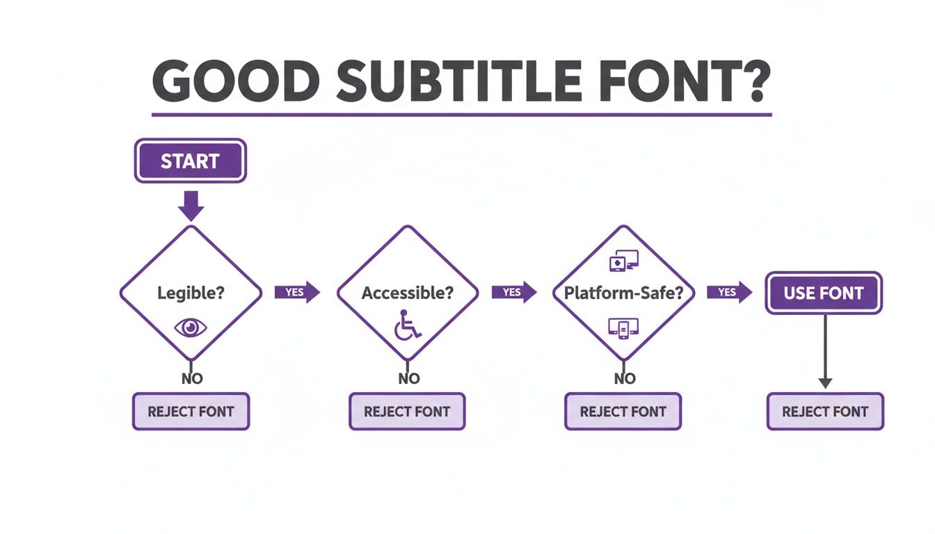
As you can see, the best subtitle fonts always put legibility, accessibility, and broad platform support ahead of pure stylistic flair.
Why These Fonts Work So Well
The success of these fonts is no accident. A strong subtitle font can massively increase viewer engagement, especially when 85% of Facebook videos are watched on silent. That stat alone makes subtitles essential for creators using tools like LunaBloom AI to produce professional videos without the hassle.
Typography experts have been cracking this code for decades. Back in 1996, Microsoft released Verdana, a font designed specifically for on-screen reading. Its wide letter spacing and tall lowercase letters are fantastic at tiny sizes—perfect for mobile viewing, where over 70% of social media is consumed today. More recently, Inter arrived in 2019, boasting a 15% improvement in reading speed on digital displays according to some typography studies.
A professional subtitle font should be invisible. If the viewer is consciously noticing your font choice, it's likely distracting them from your message. The goal is seamless communication, not a typography showcase.
Ultimately, the best font is one that serves your content without demanding attention. While it’s tempting to use a custom brand font, readability should always win that fight. A viewer who struggles to read your subtitles is a viewer you’re about to lose. For more practical tips on creating engaging video content, check out other articles on the LunaBloom AI blog.
Essential Design Tips for Readability
Choosing a great subtitle font is only half the battle. The real magic is in how you style it.
Even the best fonts become completely unreadable when they clash with the video playing behind them. A few simple design principles can make the difference between subtitles that distract and subtitles that create a seamless viewing experience. It all comes down to contrast. Your text has to stand out against any background, whether it’s a bright, sunny sky or a dark, moody scene.
Mastering Contrast and Backgrounds
The simplest way to guarantee readability is to create a buffer between your text and the video. You have a few solid, professional options:
- Background Box: A semi-transparent black box behind the text is the most reliable way to keep subtitles clear, no matter how chaotic the background gets.
- Outline (Stroke): Adding a thin, black outline around white or yellow text creates a crisp edge that cleanly separates the letters from the screen.
- Drop Shadow: A soft shadow behind the text can also work, but it's often less effective than a hard outline or background box, especially against complex footage.
Think of these styling elements as your readability insurance. They guarantee every word is seen, which is vital for accessibility. If you want to dig deeper, it’s worth checking out guides on the most accessible fonts and design practices.
Proper styling isn't about making subtitles look fancy; it's about making them disappear. The best subtitles are so easy to read that the viewer forgets they're even there, allowing them to fully absorb the content.
Getting Size and Placement Just Right
Beyond contrast, the size and position of your subtitles have a massive impact. If the text is too small, you cause eye strain. Too big, and you risk covering up key parts of the video.
A good rule of thumb is to size your font to be about 2-2.5% of the video's height. For a standard 1080p video, this works out to roughly 48-54 pixels. This size is big enough to be clear on a mobile screen without completely taking over a desktop monitor.
Where you put them matters just as much. You always want to keep your subtitles inside the title-safe area—the central part of the screen guaranteed to be visible on any device. This prevents your text from getting awkwardly cropped. Finally, keep your line lengths under control. Aim for a maximum of two lines per subtitle, with each line hovering around 42 characters. This gives viewers enough time to read and process the text.
Choosing Fonts for Multilingual Subtitles
Taking your content global means your subtitles need to speak every language fluently. This is where font selection becomes less about style and more about technical necessity.
A font that looks fantastic in English might completely break when displaying Cyrillic, Arabic, or accented Latin characters, showing up as ugly little squares—a problem developers call "tofu." This happens when a font's glyph set—its library of characters—is incomplete. The fix? Choose fonts built from the ground up for broad, international character support.
Global-Ready Font Families
When creating subtitles for different regions, you need a font that can handle a huge variety of scripts without any drama. The goal is consistency and perfect clarity in every language. Here are two of the best workhorse font families for the job:
- Noto Sans: Developed by Google with a clear mission: "no more tofu." Noto Sans is designed to support every single script encoded in the Unicode standard, making it one of the most comprehensive choices for any multilingual project.
- Open Sans: Famous for its clean, neutral, and friendly look, Open Sans comes with an extensive character set that covers Latin, Greek, and Cyrillic alphabets. It’s a solid, dependable choice for creators who need a versatile font that just works.
Picking a globally compatible font isn't just a technical decision; it's a sign of respect for your international viewers.
The Business of Multilingual Content
The market for subtitles is booming. In 2024, film subtitling alone was a USD 851.42 million industry, and it's projected to hit USD 1.13 billion by 2035. This growth is entirely dependent on fonts that perform flawlessly across languages.
Europe, which holds 30% of the market, has long relied on clean, legible fonts like Helvetica for foreign films. In the Asia-Pacific market, which accounts for a 23% share, fonts like Open Sans are critical for serving massive audiences. The data backs this up: a 2020 Ofcom study found that simply using legible fonts improved video comprehension for 68% of viewers.
When your video travels across borders, your font is its passport. A font with poor character support will get stopped at the gate, preventing your message from ever reaching its destination.
Of course, font choice is just one part of the puzzle. Understanding the process of creating subtitles in different languages helps you see why a font's character set is so vital. Fortunately, tools like LunaBloom AI make this simple by building localization features right in. You can see how it works right now in the LunaBloom AI app.
How to Customize Subtitles in LunaBloom AI
Alright, we’ve covered the theory. Now for the fun part: putting it all into practice inside LunaBloom AI.
We designed the whole process to be straightforward, getting you from a raw transcript to a polished, professional look in just a few clicks. It’s all about giving you total creative control, minus the intimidating learning curve.
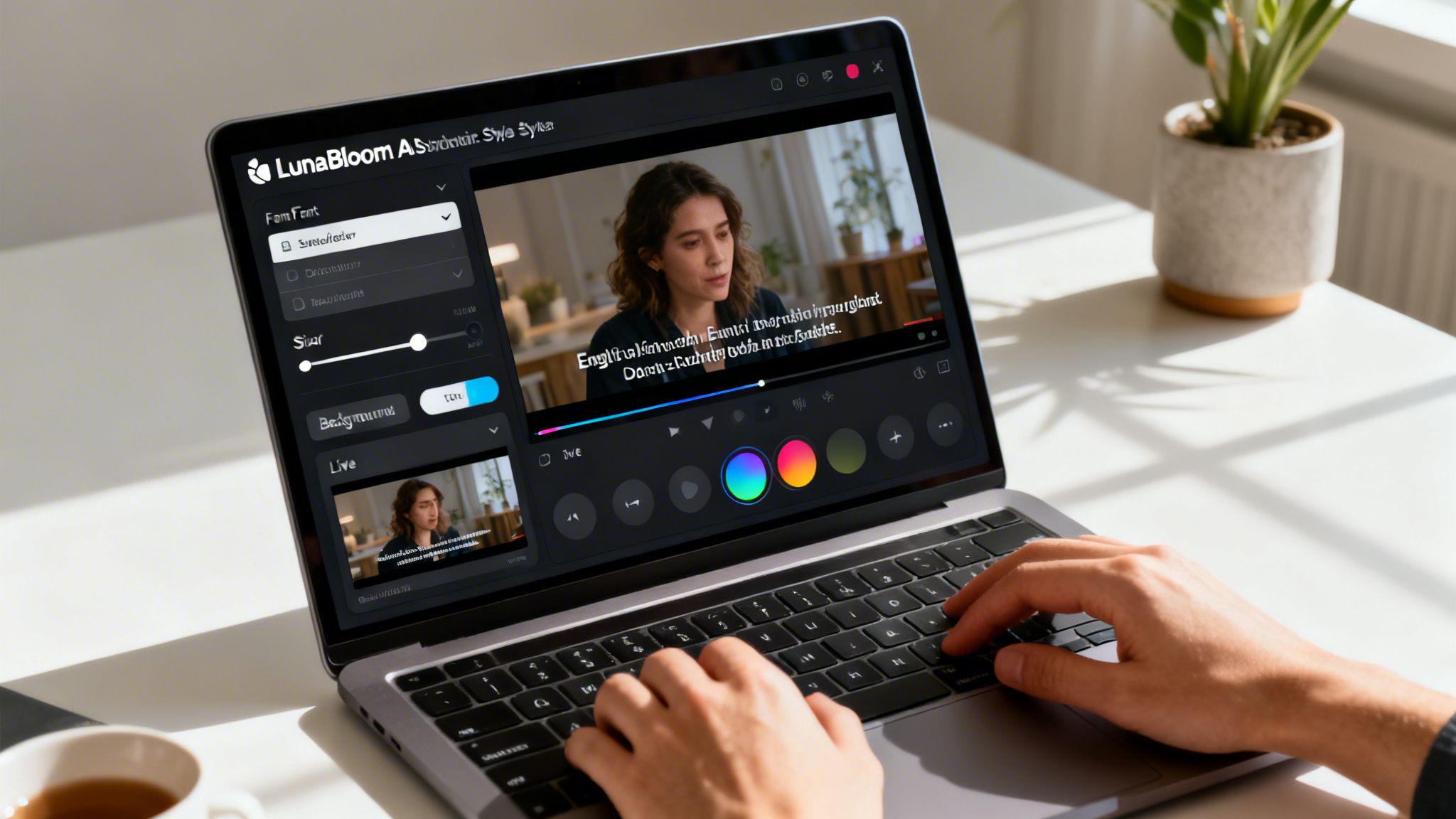
Getting into the Style Editor
The first step couldn't be simpler. Once you have your video script ready, LunaBloom AI automatically transcribes it and generates perfectly synchronized subtitles. You’ll see them appear right on your video timeline, timed to match the audio. From there, just click on any subtitle block. That single click opens up the Style Editor—your command center for tweaking every visual element of your text.
Fine-Tuning Your Subtitle Style
Inside the Style Editor, you'll find a curated library of premium, hand-picked fonts that are proven to be highly readable on screen. We did the legwork to eliminate the duds, so you can start with a solid foundation.
Here’s a quick rundown of what you can control:
- Font Family: Browse through our collection of professional-grade fonts like Roboto, Inter, and Poppins.
- Font Size and Weight: A simple slider lets you dial the text size up or down. You can also switch between regular and bold weights to add emphasis.
- Color and Contrast: Pick a text color, then add a background box or a subtle outline to make sure your subtitles are always easy to read.
Pro Tip: Always preview your styled subtitles on a simulated mobile screen before you finalize them. A font that looks perfect on your big desktop monitor might feel cramped on a phone.
We've put together a quick checklist to help you walk through the customization process and get the best results every time.
Your Subtitle Customization Checklist
| Customization Step | Your Action Plan | Pro Tip for Best Results |
|---|---|---|
| 1. Generate & Access | Upload your video and let LunaBloom AI generate subtitles. Click any subtitle block to open the Style Editor. | Review the auto-generated transcript for any inaccuracies before you start styling. A clean script is the best foundation. |
| 2. Choose Font Family | Select a font from the curated library. Aim for a clean sans-serif like Inter or Poppins for maximum clarity. | Test 2-3 different fonts against a busy part of your video background to see which one remains the most legible under pressure. |
| 3. Adjust Size & Weight | Use the slider to set a font size that's easy to read. Use bold sparingly for emphasis. | A good starting point is a font size that takes up no more than 15-20% of the vertical screen height. |
| 4. Set Color & Contrast | Pick a high-contrast text color (like white or yellow). Add a semi-transparent black background box or a thin text outline. | Run your color combination through a contrast checker. The goal is a WCAG AA ratio or higher. |
| 5. Save Your Template | Once you've perfected the look, click to save it as a Custom Style Template. Give it a memorable name. | Create different templates for different content types, like one for tutorials and another for social media clips. |
| 6. Apply & Review | Apply your saved template to future projects with a single click. Do a final watch-through to ensure consistency. | Check your video on both desktop and mobile devices. What looks great on one might need a tweak for the other. |
This checklist turns a creative task into a repeatable, efficient workflow, ensuring every video you produce looks sharp and professional.
Save Your Style and Never Do It Twice
Here's a feature that will save you an incredible amount of time. Once you've nailed that perfect combination of font, size, color, and background, you don’t have to do it all over again for the next video.
With one click, save your settings as a Custom Style Template. The next time you start a project, just select your saved template, and your branded subtitle style is applied instantly across the entire video. This maintains 100% brand consistency in every piece of content you publish. Ready to give it a shot? You can jump in and start playing with these settings right now in the LunaBloom AI starter app.
Common Questions About Subtitle Fonts
Even after you’ve nailed the basics, a few practical questions always seem to pop up. Let's clear up some of the most common sticking points people run into.
What’s the Best Font Size for Subtitles on All Devices?
There’s no magic number, but a solid rule of thumb is to aim for 2-2.5% of the video’s height. On a standard 1080p video, that works out to about 48–54 pixels. This range is the sweet spot—big enough for a TV screen but still crisp and clear on a phone. Always preview your subtitles on a smartphone before you publish.
Should I Use a Serif or Sans-Serif Font for Subtitles?
For digital screens, sans-serif fonts are almost always the way to go. Think of fonts like Arial, Helvetica, and Roboto. They don't have the little decorative "feet" (serifs) on the letters, which makes them much cleaner and easier to read at a glance, especially at smaller sizes. The simplicity of a good subtitle font is its biggest asset.
How Can I Make My Subtitles Easy to Read on Any Background?
Contrast is king. The single most effective trick is to use a semi-transparent black background box behind white or yellow text. It’s a simple fix that guarantees your subtitles will pop, no matter how bright, dark, or chaotic the video gets behind them. Another popular technique is adding a thin black outline (often called a stroke) around the letters.
While brand consistency is important, readability must always win. The whole point of subtitles is clear communication. If a viewer can't read your message, it doesn't matter how on-brand it is.
Can I Use My Custom Brand Font for Subtitles?
I get why you'd want to, but you have to put readability first. If your brand font is decorative, a script, or highly stylized, it’s probably a terrible choice for subtitles. These fonts are often distracting and hard to read quickly, which defeats the entire purpose of captioning. A much better approach is to pick a clean, legible font like Inter or Open Sans that complements your brand's style without sacrificing clarity.
This guide has walked you through everything you need to know about choosing a good subtitle font. From understanding the core principles of legibility and accessibility to mastering styling and multilingual support, you're now equipped to make choices that boost viewer engagement. Remember, the best font is one that communicates your message so effortlessly that the audience forgets it's even there.
Ready to create videos with perfectly styled, readable subtitles in minutes? With LunaBloom AI, you can generate cinematic videos from a simple prompt and customize every detail, from fonts to voiceovers, with no technical skills needed. Try it for free and see how easy it is to produce professional content at https://lunabloomai.com.